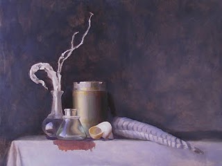
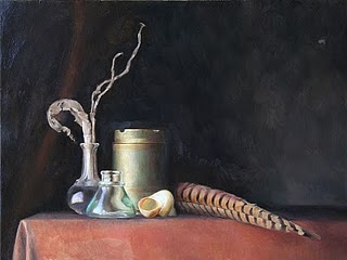
The Life of a Painting: "Between Darkness and Wonder"
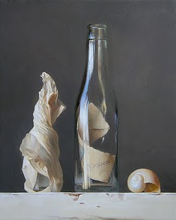
 “Between Darkness and Wonder” 16 x 20 inches, oil on panel
I’ve just completed my latest painting, “Between Darkness and Wonder.” I started it last April, but had to stop working on it for most the summer for reasons I’ll explain soon. In total I estimate I worked on it for about 10-12 weeks.
It was a luxury to work on it so long! I love not having to rush. For about a year now I have resisted committing to gallery shows for yet-unpainted work, because the pressure to make show deadlines was starting to put too much stress on the process of making my paintings. So now I have no show commitments, and I can take as long as I like on each painting.
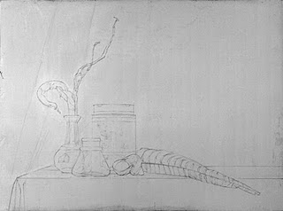
I started the painting back in April with a detailed line drawing:
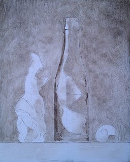
 Preparatory line drawing, graphite on vellum trace paper
After I transferred the drawing to the panel and refined it, I started a layer of umber monochrome underpainting.
 Open grisaille underpainting, Burnt umber only
In this area you can see the umber “open grisaille” transparent underpainting, with the next layer started on top: the closed grisaille opaque underpainting.
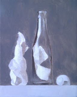
 Starting the Closed Grisaille
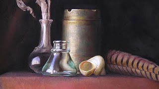
This stage is after a pass or two of color. The values and colors are still rough, and I’ve left the edges soft and blurry so I can continue to refine the drawing.
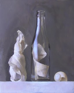
 Rough color
When the whole painting had a pass of color, I had spent 6 (somewhat distracted) weeks on it, and I was about 50% done.
At this point, my life got even more crazy and I had to put the painting on hold over much of the summer.
For one, I had agreed throughout the previous year to write a few different articles for various publications. It just so happened that the final deadlines for all the articles converged at the same time, in late June/early July.
One article was for The Artist’s Magazine, and it was a Drawing Board column about how I use the principles of light falling on an imaginary sphere to render light and shadow.
The images for the article are simply the stages of my Graphite Value Sphere exercise, so the magazine editor requested a more dynamic image to illustrate the concept. I decided to do a drawing of the hand cast in my still life, since it was already set up and because I wanted to study the shapes of the forms in more detail before moving forward with the painting anyway.
 Study of a hand sculpture, 8 x 10 inches, graphite on transluscent vellum
 Victorine Meurent portrait by ManetThe next article I wrote was about Victorine Meurent, the model who posed for Manet’s “Olympia,” who was also an artist who showed her paintings in the Paris Salon.
I was fascinated by her life as a working-class music hall performer who became one of the most iconic models in history, and amazingly was also an artist in her own right.
Little is known about her and only 1 of her own paintings has survived, but she studied at the Academie Julian (one of the first fine art schools open to women), lived into her 80’s and indentified herself as an artist her whole life. The article is published in The Portrait Society’s quarterly printed newsletter.
The third article was a step-by-step of my painting process featured in International Artist Magazine. In it I describe all the stages of my painting, Anchor in the Gale, which is the same painting featured in my instructional painting video “Indirect Oil Painting.”
 Step-by-step of “Anchor in the Gale”
Meanwhile, another big event was happening at the studio. We had been hosting Carl Dobsky along with his full time students in our space after Safehouse Atelier lost their studio back in February. But Carl’s girlfriend lives in LA, and over the summer he made the difficult decision to stop teaching his full time program, and move to LA to be with his girlfriend.
 Me and Carl in my studio right after he moved his students in
Carl is a good friend of mine, and I understood and supported his decision. I knew it was a wrenching choice to leave his students and the school he had spent years building.
His departure meant major changes for the studio, so I had some hard thinking to do. I considered disbanding the full time program, but the students were all set up and working on their cast drawings. I really enjoyed the focus and energy of having a full time program in my space. Carl had assembled a wonderful group of students, and I knew they would be disappointed to stop their studies.
I had not intended to direct a full time program so soon, it was always a distant idea. But the final decision was made easier when Carl highly recommended his former student, James Edmonds, to help teach.
I already knew James since he had been subbing for Carl’s classes occasionally while Carl worked to finish paintings for his September solo show at John Pence Gallery. James was enthusiastic about teaching the full time program, and when I offered him a position at the studio he accepted it. One of Carl’s full time students, Christina Davis, had already begun assisting me at my summer workshop, and she agreed to be my ongoing assistant for all my classes at the same time she is continuing her studies. So by hiring both of them I could continue the program.
Taking on the full time students meant I had to restructure my weekday teaching program, incorporating both part time students and full time students into all my classes. It significantly expanded the resources I can offer to all my students, but it required a lot of financial calculations, space calculations, and the procurement of more studio equipment. So I spent most of the summer planning and preparing for the fall semster, when I would start my program after our summer workshops.
 Screenshot of Nowell’s editing software for my instructional videoFinally, on top of all of that, Nowell was at home working long hours every day for months to complete the editing and production of my 3-hour instructional painting video.
As with all major projects, it turned out to be even bigger than we had originally estimated, and we both felt the pressure to get it done as soon as possible.
Nowell generally handles all the “behind the scenes” of running the studio: Keeping us stocked up with supplies, running payroll and bookkeeping, combating the never-ending beurocracies of small business, and running our home life. He managed to keep with all that while producing the video, but he was overworked for months.
So, it turned out to be a pretty busy summer!
Finally, in September my fall classes began again, the full time program (including 5 of Carl’s former students and 3 brand new students) started their school year. James and Christina came on board as employees, and very soon we were settled into a daily routine.
With all the studio’s classes, including our evening and weekend classes, we now have 125 students and 4 instructors working in the studio every week. With this amount of activity, just keeping the space functional, the instructor’s needs met, and the students productive, requires significant organization. I could easily spend all day every day just teaching and running the studio, and never have time to paint.
But I work hard to stay organized so I can preserve my daily painting hours. Once the summer was over and the new schedule of classes were up and running, I could get back to painting my usual hours: 6 hours at the easel a day, 6-7 days per week.
Finally, I was back to my painting - and then the fun part began!

With the drawing and values complete, and the color roughed in, I could focus on the details of subtle light and texture, further refining the hues and values. Every layer gets closer and closer to what I envisioned when I first started the painting.
 DETAIL of “Between Darkness and Wonder”
 DETAIL of “Between Darkness and Wonder”
The 6-month period of painting this piece has essentially encompassed a tour of my entire art life: Teaching, managing the atelier, writing articles for art publications, and working with Nowell on the videos.

Now that everyone is settled into a routine, and the instructional video has been released, Nowell and I are looking forward to a period of focused creative productivity for both of us.
And perhaps an occasional day off.
“Between Darkness and Wonder” 16 x 20 inches, oil on panel

;)
;)
;)
;)
;)
;)
;)
;)
;)
;)


;)

;)
;)