Search this Blog
Sadie's Blogs and Website

For posts 2006-2010
please visit
sadievaleri.blogspot.com

Sadie’s current site is at
SadieValeriAtelier.com

UPDATE February 1, 2021

I have recently discovered that unfortunately this Squarespace blog has failed to maintain most the images for older posts on this blog. Luckily, the original Blogger version is still live at sadievaleri.blogspot.com and all the posts and images from 2006-2010 are still visible there.

For my current artwork, teaching, and blog please visit Sadie Valeri Atelier.


Entries in painting (203)

Saturday
Feb212009

Antique Bottle: Sessions 3 & 4

I've worked a couple more days on this painting, but I'll save all the full-view in-progress shots until I post the finished painting. This detail is the first overpainting layer of the little glass medicine bottle, I'll refine it further with a second overpainting layer later, but it was really fun painting all the stains and discoloration in one alla prima pass.

See the previous post about this painting here

Tuesday
Feb172009

Antique Bottle: Session 2

8 x 10, oil on panel

This is a new little painting I started this week, a smaller size and a less complex composition than the previous four painting, just so I can get some satisfaction of completing a painting in less time.

I started with just the bottle and the shelf, I wanted to keep it really, really simple. But it just looked too boring, and after fiddling around with some twigs I finally gave in and crumpled up a small piece of wax paper and suddenly the composition was a whole lot more interesting... and also a lot harder. I was originally aiming for a 1-week painting, but this might take 2 weeks.

I thought I would share my drawing process. I diagrammed it below, on the under-painting (I did make a pencil drawing first, but I corrected the drawing with the under-painting, so I'll diagram my thinking on the better drawing.)

To start, I lay in some straight lines, trying to accurately capture the biggest, most general angles, tilts and distances. I spend quite a bit of time on this, until it "feels" like the gesture of he subject. I might break the lines into smaller segments than these, but I try not to.

Then I move into finding the curves, the major lines of movement or tension that are supporting the subject. This little piece of wax paper was behaving like an arch, so I knew I would find elements of the arch showing up here and there in the contours. The arch seems to me to have three points of contact with the board (at least from this view), so I tried to discover how it was supporting itself on these three points.

The corners peaking at the upper right are also part of the structure, so I searched for their relationship to where the arch legs are supported.

All the folds and crumple paths along the wax paper are arranged logically for how the paper is supporting itself, or being supported. I look for the main curves of movement, and as I develop the drawing along with the panting, I'll look for the smaller and smaller incidences of how the paper is logically crumpled.

When drawing the figure I follow the same method, except drawing the figure is harder.

See the first post about this painting here

Monday
Feb162009

Antique Bottle: Session 1

preliminary contour drawing
8 x 10 inches, pencil on panel

Wednesday
Feb042009

Silver Globe Pitcher: FINAL


oil on panel
16 x 20 inches
Award: Oil Painters of America 2009 Western Regional Juried Show


I made a video slide show showing all the stages of the painting and some detail closeups. You can see the movie for this painting here.


More about this painting:
In 2008 I began a series of still life paintings using crumpled wax paper as my subject. I was drawn to the material because I can twist, and crush the wax paper into draped and spiraling shapes to create dynamic environments for the simple, antique bottles and pitchers I collect.

I am always on the lookout for interesting vessels to paint, and when I found a spherical silver water pitcher at a flea market, I instantly fell in love.

Certain objects call to me and must be painted. I have learned that collecting something not-quite-right, just because I "might use it someday" is rarely successful. Those objects languish on my shelf for years, always passed over. The objects I paint resonate with me deeply and demand to be painted immediately. I had a vision of the silver globe pitcher draped in a "shawl" of crumpled wax paper, with the shawl arranged as if a small breeze were filling and lifting it.

When I set up a new still life I spend several studio days crumpling paper and discarding it, moving objects around, trying to find the best shape and composition through my viewfinder. The wax paper takes gentle coaxing and twisting to arrange it in with the feeling I am envisioning.

The final arrangement must look fresh and transparent, like it just landed there, no matter how many discarded pieces it took to reach my vision.

I begin all my paintings with a detailed contour drawing in graphite pencil on wooden panel I have prepared myself with homemade gesso. I spend several days on the drawing, first on trace paper and then directly on the board. I find that if I spend the time needed on the drawing, the structure and believability of the final painting is more successful. I never rush the drawing process, even when I am anxious to begin painting.

Once the drawing is finished, I paint in many layers over the course of a month or more, first in grays, called a "grisaille", to establish values, and later in color. I use tiny brushes from start to finish, and work on a small area each day. I move slowly around the painting, bringing each section up to the highest degree of finish possible before moving to the next area. Silver Globe Pitcher took me over 120 hours to complete over the course of 2 months.

It is only the latest stages of my process where I get to enjoy the beautiful and most subtle effects of light and texture on the surface of the objects, like the turquoise tarnished area at the base of the pitcher, the transparent paper melting into the background, the pedestal of the pitcher peeking through the folds of paper. But it requires all the earlier stages of building a solid drawing and value structure in order to successfully render the beauty I see in the surface details.

Silver Globe Pitcher is a rare instance where I include a self-portrait in my painting. I wanted the self-portrait to be a discovery, so the viewer sees and appreciates the whole composition first, before noticing my tiny image reflected in the vase. That way, each viewer has a sense of having discovered something on their own, a small secret in the painting.

My self-portrait embedded in the painting allows each person to discover my own image peering back. The viewer can see the entire little studio where I worked on this painting, and have a sense of being able to get a glimpse into the experience of the painter.

See the previous blog post about this painting here.


Tuesday
Jan272009

Silver Globe Pitcher: Overpainting Stage 5


All of today's painting session was spent refining this area of the wax paper. I'm really enjoying all the transparent folds.

See the previous blog post about this painting here.

Tuesday
Jan272009

Silver Globe Pitcher: Overpainting Stage 4

16 x 20, oil on panel (detail)

I had a lot of fun with this left section of the the wax paper. The big chunky flap of paper in front was a huge lesson in remembering not to have "tunnel vision", remembering to compare the local value range to the entire painting. This area has a huge amount of information all within a few very short steps of value, so I had to be careful not to be tempted to exaggerate. Then the highlights are in another value stratosphere, making it all even more complicated!

I am thrilled to report that my recent video painting demo got a wonderful (embarrassingly wonderful) writeup on the blog Art Studio Secrets. In addition to the very nice things written, I am also flattered because the other artists profiled on this new blog are artists whom I have long admired: Alex Kanevsky, Carol Marine, David Kassan, and Paul Seaton.

See the previous blog post about this painting here.

Tuesday
Jan202009

Silver Globe Pitcher: Overpainting Stage 3

(detail)

Here's a sneak peek at my little self-portrait in the silver globe pitcher.

I thought I wouldn't get much done today with so much juicy politics to watch, but Obama's Inauguration speech this morning (9am my time) was so energizing that when it was over I was too jumpy to watch more on TV, and I was out in the studio painting all day. I did listen to live NPR dissection of the day's events all day.

I've been reading the book "Flow", which is all about how optimum human experience occurs when we focus on challenging work, so I particularly liked this part of the President's speech:

"...there is nothing so satisfying to the spirit, so defining of our character, than giving our all to a difficult task."

Who can disagree with that?

See the previous blog post about this painting here.

Friday
Jan162009

Silver Globe Pitcher: Overpainting Stage 2

Detail of work in progress

Detail of work in progress, previous stage

The handle and spout of the silver pitcher has been giving me some frustration, there's a lot of very close, dark colors, punctuated by very bright highlights. Everything depends on very accurate drawing at these stages, the slightest wavering of paint strokes makes for a wobbly pitcher handle. After much wrestling, I'm feeling like I'm closing in on it, though.

I've also been struggling with the swatch of wax paper that runs behind the pitcher. The crinkles up in the right corner catch the light and jumps out quite a bit, but if I paint them with too much contrast they look a) too eye-catching and b) dumb. It's been a lot of push and pull to get it to this stage.

For some reason the bottom pedestal of the pitcher I worked on last week was a breeze in comparison to these areas, even with all that semi-transparent wax paper overlapping the pedestal.

All these photographs are reducing the color saturation compared to the actual painting. My paintings are of course very monochromatic, but I use a full range of hues to mix my neutral colors, and in person you can see a lot more range of hues within the values. For the final photo I'll work harder to get a very accurate photo.

Mediums:
I still like working with the tubed Maroger quite a lot, but it has a tendency to dry fairly matte in the dark areas. So I'm going back to the linseed-based medium for the darks, especially the background. I'm sticking with the Maroger for the light areas.

See the previous blog post about this painting here.

Friday
Jan162009

Color Mixing

I thought I'd give a little introduction to the palette I use and how I mix my colors.

COLOR THEORY

There are many different color theories - models and philosophies for understanding how color behaves. I use a methodology of color mixing that I learned from my great and most influential teacher at RISD, Anthony Janello. Tony however might cry to see what I have done to his beautiful color system, as I use it to mix up mainly grays, while he is a high-chroma colorist. I can't find any of Tony's paintings online, but I did find a recent student of his who posted the kind of color studies I also did in his class.

As my approach has evolved it's become my own and I don't think any of my teachers would appreciate me crediting them with my color handling, as I basically create monochromatic paintings. But you could use the same fundamental color theory to make highly chromatic paintings, it's all in the proportions.

PALETTE

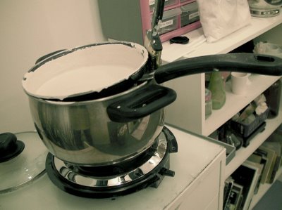
My palette is limited, essentially primaries: a red, a yellow, and a blue, plus a couple others that I've discovered save me time, plus white. I arrange my colors is roughly rainbow order, and I always put them in the same order. The specific colors I use evolves all the time, but right now I'm using these (as seen left to right on my palette above).

titanium white (two puddles in case the first gets contaminated)
magenta
cadmium red
cadmium orange (I use it as a yellow)
yellow ochre
sap green
cobalt blue
ultramarine blue
mars red (actually a rich brown)

A note on black: I don't use it because it makes more problems for me than it solves.

A note about "red" - the red we were taught in kindergarten to mix with blue to make purple does not work. Magenta is a "true" primary color, meaning you can use it to mix a secondary color. Magenta is my "red". Cadmium red is really an orange, and mixing it with blue makes mud.

MIXING

For purposes of vocabulary:
Hue is color
Value is light and dark
Chroma is intensity/brightness

Any swatch of color can be defined by it's hue, value, and chroma. When you mix any two colors together, the chroma/intensity is always reduced - a bright yellow and a bright red will make a slightly less intense orange. Different hues also have different values. So the complicated thing about color mixing is how to get the color/hue you want while also controlling the chroma and value.

Before I start painting I mix up a few puddles of dark paint and light paint for the areas I'll be working on and make some 5-step chains of puddles between the darks and lights. Mine are neutral (low chroma), but you could use highly chromatic/colorful chains, too.

To start mixing, first I choose the value puddle I want, and then if the paint mixture is too red, I mix in the complementary or opposite, green; if it's too purple I add yellow, if it is too blue I add orange.

Any two colors mixed together will lower the chroma/intensity. So any two colors opposite each other on the color wheel will essentially cancel each other out. I use this "canceling out" to mix subtle shifts between hue, value and chroma. Memorizing the color wheel is the most helpful thing you can do as a painter.


With this method I can mix subtle shifts of hue, value, and chroma. I essentially visualize the color space in 3 axis of dark to light, intense to less intense, and one side of the hue to the other - blue and orange for example. I picture my puddle of paint where it exists in my color model, and "push" it around the three axis: darker or lighter, bluer or more orange, more chromatic or less chromatic.

Different colors also have different values right out of the tube. So if I am mixing a dark neutral, and it is too blue, I don't mix in a high-value orange like a cadmium, because the value will lighten while the chroma decreases.

Which is why I like Mars red - I use it like a low-value orange. I use sap green for the same reason - it's a higher chroma green than what I can usually mix, an I use it to "cancel" with magenta, cadmium red, or mars red.

I use two blues for the same reason - both are high chroma, but one is much lower value, so I use ultramarine for low-value mixtures, and cobalt for high-value mixes.

After a while the system becomes intuitive and you don't think about it much while you paint. But I still sometimes get stuck and have to ask myself "what color is this paint?" to notice it is purple, and I better add in some yellow or I'll end up with a purple painting.

A note about paint quality:
It's always worthwhile to buy high-quality paint. The cheap tubes simply have more oil and less actual pigment, so you use more paint anyway.

A note about lighting:
Light is very very important. If you paint under a normal lightbulb, the yellow tint will distort your perception of all the colors. The more I paint, the more I find the only true light is indirect daylight (north light). At the very least, paint with a full spectrum, daylight, color corrected lamp designed specifically for artists for shining on your easel. However, you can shine any color light you want on your subject, as demonstrated with magnificence by Dan Thompson.

For more color theory:

Munsell is a great introduction for understanding hue, value, chroma, although I don't follow the methodology. I posted their chart above.

Handprint is an amazing site for understanding the science and practical mixing of color. It's focused on watercolor but much of the information applies to paint of any kind.
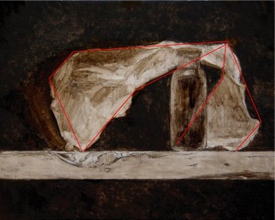
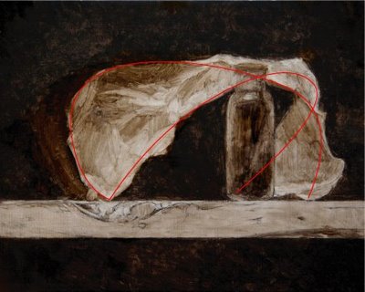
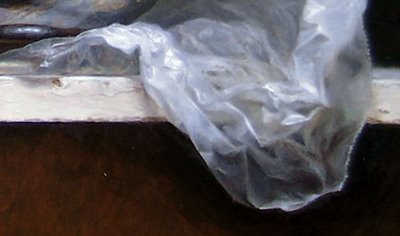
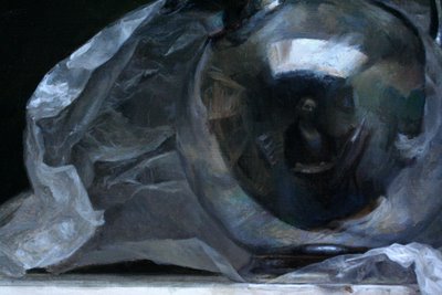
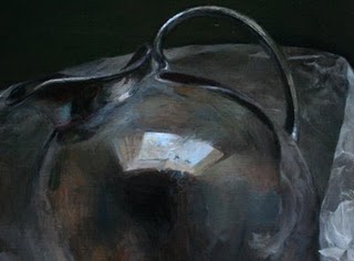
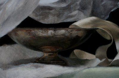
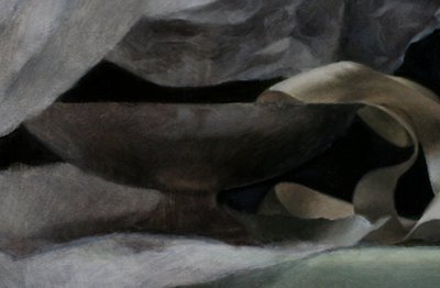
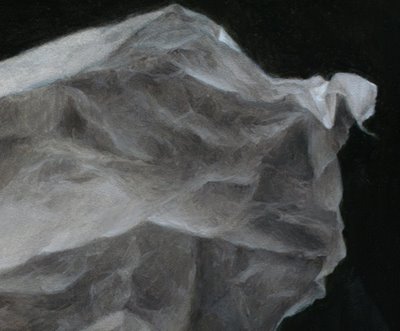
Friday
Jan092009

Silver Globe Pitcher: Overpainting Stage 1

Globe Pitcher, overpainting stage 1
oil on panel
16 x 20 inches
(work in progress)


The going is slow but I'm finally in the zone on this painting and starting to really enjoy it.

I'm experimenting with different mediums - my normal one based in linseed, a new one based on poppyseed oil, and a very nice big tube of Maroger medium my father gave me for Christmas. I didn't know your could buy it in tubes, I thought you had to make it yourself and it sounded complicated. So far I like the tubed stuff, it's a stiff golden brown gel that mysteriously liquifies and turns clear when mixed into the paint. I'm curious to see what it's like after it dries a bit. The poppyseed oil based medium dries too slow, completely wet even days later.

I've started looking for a studio to rent so I can have enough space to paint and draw a model. I'm looking for a north light studio with about 400 square feet here in San Francisco.

See the previous blog post about this painting here.

Thursday
Dec112008

Silver Globe Pitcher: Underpainting

Globe Pitcher underpainting
oil on panel
16 x 20 inches
(work in progress)

This is the completed underpainting for my most recent Wax Paper Series painting. I started this composition with sketches and a detailed contour drawing you can see in this previous post.

Using trace paper I transferred my drawing to the gessoed panel. I refined the drawing directly on the panel in pencil.

My goal was to get a very accurate drawing that described the gesture and energy of the crumpled paper, as well as a very precise geometry for the silver globe pitcher. Badly drawn round and elliptical objects in still lifes look wobbly and unconvincing, so I took a lot of time to make sure the silver globe is the correct shape. The pitcher needs to have a believable structure to make the whole painting convincing.

Contour drawing transferred from paper to panel

Once I was satisfied with the drawing (although I'm never satisfied with the drawing) I moved on to a transparent wash underpainting. Traditionally artists use a tiny brush to outline the contour drawing to "set" the graphite. I've never felt the need to do this, I find that this first wash layer of underpainting sets the graphite and I don't ever notice the pencil marks mixing with the paint in later stages. Most traditional artists would advise against this, though.

First layer of the underpainting

With the underpainting I "knock down" even the lightest lights. I've learned it's annoying and difficult to paint white paint over a white ground, so I cover every part of my surface with at least a light layer of umber paint. But I try to get a fairly full range of values so I can get a feel for what the whole painting will look like.

Second layer of the underpainting

Below I have finished the underpainting and started a small part of the opaque layer. The underpainting is transparent, meaning I use turpentine to thin the umber paint to show the white of the panel beneath. The opaque layer uses white oil paint.

Final stage of the underpainting

As you can see in the final underpainting above, there are some patchy "dry spots" especially in the upper left dark area of the painting. This is where the paint has started to "sink" into the gesso ground, and the more matte areas look chalky. This will be solved with later layers of medium-enhanced paint, so the background will look deep and dark.

So far I am really enjoying working on my hand-gessoed panels. The surface is silky and smooth but the paint really seems to "grab" it. It feels good to paint on. Which makes me happy, because gessoing the panels was a lot of work!

Below is a closeup of the beginning of the first opaque layer of painting - you can see where the upper areas of wax paper are more white and refined, that's the opaque layer:

Detail of first layer of opaque painting over transparent underpainting

To bring the painting to a convincing finish I'll have to work at least two more layers of opaque paint over this layer, probably several more in many places. At this stage I'm just laying down a "bed", so the general values and basic colors are correct. With these decisions solved I will be able to really focus on one area at a time without having to constantly back up and compare the values and colors to the rest of the painting.

See the previous blog post about this painting here.

Thursday
Oct232008

Home-Cooked Gesso

The messy studio - a far cry from the "gallery look" of last weekend!

I've finally decided it's time to bite the bullet and become a painter who preps my own supports.

"Support" is the general term for what an oil painting is painted onto, either a wooden panel or stretched canvas. I prefer wood panels to stretched canvas because the surface is smoother and more rigid.

Previously I have mainly used factory-gessoed wood panels, like GessoBoard. Gesso is the chalky white paint that is layered on a canvas or wood panel before you start an oil painting. But I've decided that if I'm going to spend 60 hours on a painting, I may as well spend a couple hours preparing the surface.

So being an all-or-nothing type, I dove in and spent 3 solid days layering 19 panels with 2 layers of rabbit skin glue and 5-6 coats of homemade gesso, sanding between each layer. My right deltoid muscle aches to say the least.

I used traditional gesso materials from Sinopia (glue crystals, chalk, and white pigment) and combined them using their traditional gesso recipe. For the wood panels I used ArtBoards of all sizes, rectangles and squares from 6 x 6 inches up to 18 x 24 inches.

I bought a single burner hotplate for using in my studio, and improvised a double boiler by nesting two old cooking pots together - two pots that won't ever be used for food again.

First I soaked the rabbit skin glue crystals in water overnight, which made a transparent, gelatenous gray lumpy mixture. Then I put the mixture into my double boiler, and when it warmed up it got clearer, runnier, and became a thin, watery glue. It spread really easily onto my wood panels with a housepainting brush, but immediately began to sink in to the wood and dried almost instantly.

Re-reading the directions, I found out I had to do TWO coats of the glue. It wasn't too horrible, and I have a good ventilation system in my studio, but there was definitely a distinctly funky odor. I don't know exactly how they make rabbit skin glue, but I imagine vegetarian painters don't use it.

Once the panels were sealed with the glue, I mixed together the chalk, white pigment, and remaining glue mixture and warmed it to make the gesso. It made a watery, not very paint-like liquid, so I had to play around with the proportions a bit. But I found it works best if it's slightly more watery than housepaint, so you can paint thin layers.

This was how I stacked them to dry, "good side" leaning down to avoid dust, but careful not to let the front surface touch anything. I got pretty good at perfecting a sort stable mutual leaning system. Every time I added a layer of gesso to a panel, I had to lean it up to dry, and by the time the last was painted the first was ready to be sanded, so I had to rotate them around quite a bit.

The sanding was the most tedious part, and my arm began to really ache. The second and third day I tried to use my left hand as much as my right to sand, so now both my arm ache.

Anyway, the project was a success - I now have 19 beautiful panels with a silky/chalky/smooth surface, plus a dozen teeny tiny panels that were just laying around the studio, for little oil sketches. Hopefully I won't have to do this again for a long time!

Friday
Aug292008

VIDEO DEMO: Wax Paper and Ribbon

Friday
Aug292008

Wax Paper and Ribbon: FINAL (SOLD)

Wax Paper and Ribbon SOLD
oil on panel
12 x 12 inches

See the previous post for this painting


This painting will be showing at San Francisco's ArtSpan Open Studios Exhibition beginning with the Private Preview Gala October 4th. Each participating artist submits one piece to include in the show, so it should be a pretty eclectic event.

I will also be opening my studio to the public as part of ArtSpan's Open Studios for the weekend of October 11 & 12. More details coming soon.

Friday
Aug222008

Wax Paper and Ribbon: Session 10

session 10 (detail)


I worked most the day on the wax paper, but after nearly 3 days staring at the same texture my mind just about revolted, so I switched in the late afternoon to working on the pedestal bowl. It's silver but it's all tarnished and it was SO much fun to paint. I barely had to fiddle, just cranked out the whole layer in one pass. I'll probably deepen it later with some glazing when it's dry, but it's fairly done I think.

I really like the feel of working on a layer of transparent medium - I coat it all over the area I'm going to work in, and then the strokes go on silky but just a tiny bit of grab, especially if it's had a few hours to set. I just use a simple medium of 1 part stand oil and 2 parts linseed oil.

Friday
Aug222008

Wax Paper and Ribbon: Session 9

session 9 (detail)
click image for larger version


I spent all day working mainly on the wax paper. I found myself making very different brush strokes than usual. I haven't been paying much attention to brush strokes the last few months because I decided that worrying about my marks was making me pay more attention to my painting than to the subject. So I decided to abandon ideas about mark-making and just pay attention to the subject exclusively.

But here they are, creeping back in. I'm actually excited about it, because I feel like I am making the marks in response to the form I see, and not in response to an "inner eye" idea of what a mark should look like. These marks have a light, feathery touch and flick up at the tail. But it's totally different from how I painted the ribbons, unfortunately.

It will be interesting to see how (and if) this painting comes together.

Tuesday
Aug192008

Wax Paper and Ribbon: Session 8

oil on panel
12 x 12
work in progress


I worked on refining the ribbons more, and another pass on the right half of the wax paper but still fairly general values, nothing specific. I also did a layer to darken down the background, and applied a layer of transparent glaze overall.

I've been having trouble with the under layers "lifting off", and I think it's because the medium I was using contained turpentine/thinner. I switched to a medium of just linseed and stand, no turp at all, and I'm hoping this starts sealing down each layer so I'm not struggling so much with applying the paint.

I'm still filming, but I'll probably just post a nice big movie of the whole process at the end.

Tuesday
Aug192008

Wax Paper and Ribbon: Session 7

session 7 (detail)

I spent some time today on the ribbon area, this is a close-up of the before and after.

Tuesday
Aug122008

Wax Paper and Ribbon: Session 6

12 x 12 inches, oil on panel
in progress: "ebauche" underpainting

See the previous post for this painting


I had a studio drama today. I tried to make a tiny adjustment to the wax paper in the setup, and accidentally knocked an entire loop of ribbon off of the silver platter. The loop then flopped over the rest of the ribbon pile, pretty much distorting every inch of the curls. AACK.

I held my breath and spent several tense minutes nursing all the loops back into their respective positions. For several horrible moments I didn't think I'd be able to salvage it, and imagined all the work involved to re-draw and repaint it - I've already invested 20 hours of work onto this little 12 x 12 scrap of board. But thanks goodness, the satin fabric had some "memory" of the curls they have been sitting in for a week now and eventually they settled back into a fairly close semblance of their original position.

Anyway, it sounds small but I was pretty shaken imagining 5 days of work nearly negated, and had to stop painting and watch an hour of TLC "What Not to Wear" to recuperate. Drama drama.

Once calm I resumed painting and managed to finish the second layer of underpainting. I even remembered what it's called, this opaque underpainting: "ebauche". I guess that's what I am doing.

I'm excited to have such a developed foundation to start the "real" painting on. With the earlier stages of contour drawing and underpainting there is no magical illusion, just preparation - all the work but little satisfaction. It will be fun to paint on this surface where I have already taken a stab at the drawing, value and color decisions.

Now the painting needs to dry before I can continue, which is good timing as I have a friend arriving from the East Coast tonight to visit and won't have time to paint for a few days.

I am continuing to film the time-lapse, but editing it and posting it take a lot of extra time so I won't be posting the videos very often.

Finally, thanks to those who have written me such encouraging emails and comments. I consider this my own personal art journal but it's always really nice to know other people are enjoying following along, and I think all artists need as much encouragement as we can get. So thank you, it means a lot to me.

Monday
Aug112008

Wax Paper and Ribbon: Session 5

12 x 12, oil on panel

After completing the umber underpainting yesterday I started the opaque layer.... at least I thought I did. I am trying to keep the paint fairly thin and under control, and also within a slightly reduced value range (I'm not going up to the lightest lights yet) so even though I am using color plus white and the paint is more opaque, it's functioning more like an underpainting.

I find myself thinking several steps ahead: not painting what I want the final painting to look like, but thinking what the next layer of paint will look like on top of what I am currently painting. But I feel like I'm in deep water, I guess because I am sort of teaching myself at the moment.

By the way, a fellow artist blogger who is re-teaching himself to paint and draw using traditional techniques has recently come back online after a break from blogging with some astonishing work. I think you'll enjoy seeing what he's up to, here is his site: Learning to See

Page 1 ... 3 4 5 6 7 ... 11 Next 20 Entries »