UPDATE February 1, 2021
I have recently discovered that unfortunately this Squarespace blog has failed to maintain most the images for older posts on this blog. Luckily, the original Blogger version is still live at sadievaleri.blogspot.com and all the posts and images from 2006-2010 are still visible there.
For my current artwork, teaching, and blog please visit Sadie Valeri Atelier.
Entries in still life (130)
Box Still Life SOLD
 Friday, January 5, 2007 at 3:57AM
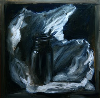
 My goal for 2007 is to complete 10 larger, more detailed works, 11x14 and up, in addition to several dailys a week. To start off I am warming up with this painting, which is still small, but will be more detailed and will take several days to complete.
A major difference with this painting is that I am using artificial light, so I can paint after dark from life. I have one light source pointing at my still life, and another light source lighting my easel. I have never done this before, so it is an experiment for me. But it's a good way to get more painting hours into the day.
I am starting with a monochromatic underpainting, and will add color with glazing after another session or two. For this monochromatic phase I am using only raw umber, ultramarine blue, and titanium white.
In-progress shots:
 Phase 2
Adding in the white and ultramarine. I threw in the highlights on the bottle too early, they are in the wrong place.
 Phase 4
More details within the shadows of the tissue, starting to show some of the depth of the composition. Bottle is closer to correct proportions, but still maybe too narrow.
The bottle, the tissue paper, and the box are all elements I have started working with in my daily paintings these last couple months. Before the daily painting practice, I never would have set up this composition. I am really enjoying all of these elements: my little amber pharmacy bottle casts a really great glow you will see when I add the color.
The tissue paper I am really enjoying for the dramatic qualities, I spend quite a bit of time "sculpting" the paper before I start painting. And the box I think makes a better composition - instead of just an object floating in the black, the positive and negative spaces are more interesting. The box also gives a feel of an environment to enter, making a mysterious little space to explore.
This painting is slightly larger than life, and I think a really large painting of a similar composition would be especially interesting; the intimate made huge, a tiny space enlarged. It's the kind of thing I would have loved as a child, imagining myself small and exploring the dollhouse. I never played with dolls, but I loved to make houses for them.
Bottle in Tissue
 Wednesday, January 3, 2007 at 10:41PM
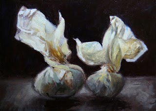
  5 x 7, oil on panelToday's painting has a looser style and a more expressive brushstroke, which adds a lot of movement. But I think some of the transparent feeling of the tissue paper is lost when the paint strokes are more evident.
I'm thinking of starting a large one of these "tissue paper" paintings, and am wondering how to approach it - chunky paint and loose brushstrokes, or soft, transparent glazes without visible brushwork. Stay tuned.
Vase in Tissue SOLD
 Saturday, December 30, 2006 at 10:18PM
 Brushes:
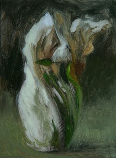
I created this painting using round brushes, I started sketching with size #8 and spent the second half of the day with size #2. I also used a #14 filbert to smooth out the background.
I always paint with two brushes at a time of the same size and shape - well, I paint with one brush and hold the other in my left hand, with the palette. I switch back and forth between the brushes constantly, occasionally giving them both a good cleaning in my Silicoil jar of turps. One brush is reserved for lights, and one for darks, which helps me keep my brushes and colors clean.
Colors:
I tend to settle on 3 so-called "primaries" plus Titanium white, even if I start out with more colors laid out on my palette. Today I used: Cadmium Yellow Deep, Permanent Violet Medium, and Ultramarine Blue (all Rembrandt brand). I also used Sennelier brand Phthalo Green Cool, which helped capture the bright green light shining through the vase - better than Ultramarine & Cad yellow mixed together would have.
Process shots:
Tissue Wrapping
 Wednesday, December 27, 2006 at 3:11AM
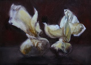
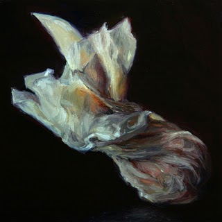
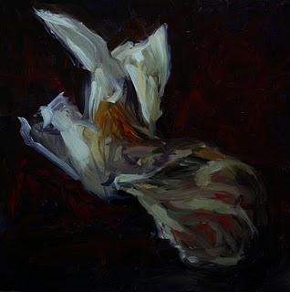
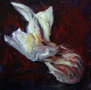
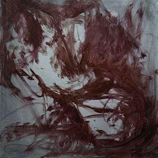
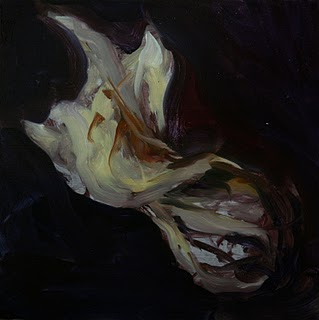
 I was attracted to the subject for the dramatic feel of the twisted paper, like a frozen wave or cloud. A full value range of lights and darks and a full hue range of warm and cool colors are represented, presenting an interesting challenge to paint.
I'd like to do a series of large compositions over the next year, so maybe this will be a study for a larger and more refined painting.
Process shots:
 Phase 1
 Phase 2
Phase 6 - Final Painting
Maple Leaf in a Bottle SOLD
 Wednesday, December 20, 2006 at 7:10PM
 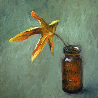 6 x 6, oil on panel
New Colors
I'm really loving the cad red med (PR108) for it's saturation and transparency, no chalkiness when mixed with dark colors, and has a lovely stain when mixed with lighter colors (aka yellows). But I went back to my normal cad yellow medium (PY35), the new cad yellow light (PY154) I find frustratingly weak, although maybe it will be good for very subtle tinting like warm highlights. I like the new quinacridone rose too, but am finding I prefer my old permanent violet medium if I had to choose just one cool red/magenta.
Oh no.... strangely, both my cool reds have the exact same pigment code (PV19) marked on the back of the tube, and both tubes are Rembrandt brand, and yet Perm. Violet Medium is a dark cool purple and Quin. Rose is a brighter cool red. I really don't understand that. Something in the paint besides pigment is defining the color? This color thing is complicated.
New Lamp
I painted in daylight today, but photographed the work with the new lamp as the only lightsource and wow, I am really impressed with the color. I used a daylight white balance setting on the camera and then didn't have to do any color correcting at all once I got the digital image into Photoshop, the colors were right on. Also the sheer top-down angle really reduced the glare factor. So I can shoot right on my painting easel and dismantle my "photo-studio area". So that's made this lamp worth it's $88 price tag right there.
Leaf with Ring Box SOLD
 Monday, December 18, 2006 at 5:19PM
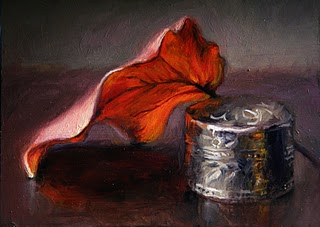
 It's done! I only needed two more hours on it, I could have finished it the day I started it if the sun didn't set so early. (See below for the process shots done a few days ago).
I decided some of the background brushstrokes were too busy & distracting so I smoothed it out a bit, and made the background cooler to contrast with the warm leaf. I also increased the value contrast by making darks darker and lights lighter, and I refined the top side of the leaf.
Click this picture to see an animation of the process:

I bought some new paint colors today from the recommended palette on handprint.com. I could immediately tell a satisfying difference in the reds: quinacridone rose (PV19) and cad. red medium (pr108) instead of my old alizarin and cad red deep seemed like more intense color out of the tube and remained saturated when mixed with other colors. There was a real "wow" feeling when I started playing with them.
The yellow (P154, called perm. yellow light in the Rembrandt line of paints) I didn't like so much- felt really "weak", like I had to use a LOT to make an effect and it seemed chalky when mixed with other colors - "reduced chroma" the handprint site would say. But I'll keep playing with it, and maybe try some other yellows he recommends. I also bought a new green (PG7) but I am scared of green... after having a primary palette theory drilled into my head in art school, I feel like I should mix my own green, but I'll try it. I need a whole lesson on using greens I think.
I also bought a full-spectrum light that clamps to the easel and shines on the canvas, if it works (although I'm doubtful) maybe I can continue painting after the sun goes down. And I bought several new round brushes - Kolinski brushes are my favorites. Looking forward to experimenting with my new toys this week.
Leaf with Ring Box - Work in Progress
 Saturday, December 16, 2006 at 7:48PM
 It's been overcast all week, but yesterday was warm and sunny, so after lunch we walked their dog to a nearby park where I collected a handful of leaves to paint. This is one of the leaves.
I would like to work on this for another session so I'm not uploading it to eBay yet. My process shots are below:


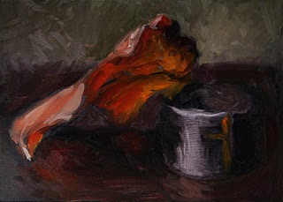
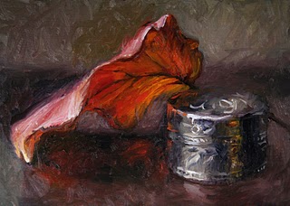 I want to continue tomorrow or Monday because I want to try for more detail. Also, I have to work on colors more: The top of the leaf is supposed to be bright red while reflecting the cool white light, and I'm having a hard time making it look pale, cool red (pink?) while also contrasting sufficiently with the the warm underside.
I'm struggling with brush strokes these days. I've noticed that when the paint gets thick, each brushstroke from a Filbert shaped brush is shaped like a trough, with thick new paint on the outside edges of each stroke, but the center carving into the paint below. As light as I can touch the brush to the surface, I can't seem to stop this from happening. So I am going to try using Rounds soon.
I'm starting to wish I had a teacher to answer all my questions. Suggestions and tips from fellow painters would be welcome. What brush shapes do you use?
Handprint Color Theory
 Saturday, December 16, 2006 at 2:00PM
 I just have to post about Handprint, a fascinating site about color theory.
This site, written over several years by Bruce MacEvoy, is a detailed description of his personal exploration of color along with his analysis (and debunking!) of the main traditional color theories. Each theory is described in detail and tested methodically. It's meant for watercolor but many of the philosophies seem applicable to oil paint.
Tin Ring Box SOLD
 Thursday, December 14, 2006 at 7:31PM
 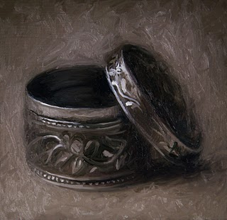 6 x 6 inches, oil on panel
This is a tiny engraved box smaller than one inch across. Since the subject is small and monochromatic, and the painting itself is small, I expected to spend an hour or two on it. I ended up spending four hours!
My goal was to experiment with loose, interesting brushstrokes that also describe an accurate and precise form. I find ellipses to be one of the most challenging shapes to draw with accuracy. You can see from my process shots below how the shape wobbles and falls apart and comes back together at the end:
I started with a Raw Umber oil sketch on an acrylic toned panel. I started fleshing out the basic forms with a gray-green I mixed from cadmium yellow, ultramarine blue, some magenta, and some white. It looks murky because I am trying to keep everything soft and indistinct while I work out the proportions and placement - not very pretty, but easier to change things if I need to. This is the fun part - I start swirling in some details with a light green gray to finalize the drawing phase and establish the full range of values. The paint is not very thick and the the red panel beneath is still showing through, but the basic elements are all in place. I find that almost every painting I do has a "crisis period", and here it is. I lose control and I get a little panicky trying to move it back towards the painting I see in my head. Here the painting has dissolved into wobbly ellipses and pasty shadows - the result of a dirty brush and losing the structure of the drawing while I focus on the details. How much prettier my process would be if I could just jump from Phase 3 to the final painting. But as much as I hate it, the "crisis phase" is always a learning experience. Ok, I managed to pull the painting together to a place where I am happy with it and it stands as a finished piece. The ellipses are precise and convincing while the overall style is loose and dynamic. I lost some of the most expressive brushstrokes of Phase 3, so I still have to work on that, but it's been a good exercise for me. I compare this to my previous monochromatic still life, Vase and Creamer done just 7 weeks ago, and feel I have already learned a lot through my Daily Painting practice.Mandarins in a Blue Bowl
 Wednesday, December 13, 2006 at 8:32PM
 Today I'm posting the finished product of a 3-day painting. Read up from the bottom of December 11 to see the painting evolve. You can also watch an animation of the painting.
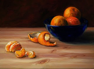
For the final few hours of the painting I tinkered with the fruit. I ended up peeling another mandarin for the curl of peel; the one I was using before completely withered over the last couple days. The fruit in the bowl now have solid round forms, and all the colors are deep and saturated.I also made some final refinements to the peeled fruit in the foreground. I added some contrasting light and darks, and I emphasize the orange glow of light shining through the single slice in front.
In this phase I concentrated on the background and the butcher block surface. I glazed the whole backdrop darker; the pattern detail I'd thought about including seemed distracting. I also decided the cutting board was too warm, so I completely repainted it in cooler colors and added more detail of the wood grain and knots. I think the cool color better captures the feeling of the winter light, and makes the orange fruit really pop. I also refined the bowl in this phase, adjusting the reflections and subtleties, and deepening the shadow, giving it a blue cast on the edges. I decided to remove the piece of rind to the right of the bowl as it was cluttering the composition.Mandarins in a Blue Bowl - SESSION 2
 Tuesday, December 12, 2006 at 7:08PM
 Today is a continuation of the painting I began yesterday. It's not yet for sale, I'll probably finish tomorrow and post it on eBay tomorrow evening. Read up from the bottom of yesterday's post to see the painting evolve:
Here you can see I've been brightening up the colors of the fruit in the bowl. The challenging part of this is making the light side of the fruit distinct from the dark side, without making a sharp corner nor a muddy mess where they meet.I worked on the blue bowl so it looks more like transparent glass and not like an opaque ceramic bowl. I also made it more symmetrical and fixed the ellipse of the edge so it is more accurate and convincing.
A few problems to work on tomorrow: The fruit in the foreground is more detailed now and looks very different from the style of the rest of the painting. Also, the actual orange peel is starting to dry out and the shape is changing. I soaked in it water for a while today to plump it back up, I hope I can get away with doing that another day. I also need to deepen the shadow cast on the ground by the bowl, it's actually quite dark in real life.
I worked for a while adjusting the size and shape of the fruit in the foreground, adding detail to the background, and suggesting the wood grain of the cutting board surface. At this point I realized that the colors were getting muddy - every new brushstroke mixes with the paint underneath so you don't get clean fresh colors if you push the paint around too much. You can see it's especially a problem on the dark side of the fruit in the bowl.Mandarins in a Blue Bowl - SESSION 1
 Tuesday, December 12, 2006 at 1:33AM
 Today I am starting a slightly longer painting, I plan to work on it for a few days and describe my process and thinking along the way. At 9 x 12 inches it's a little larger than my recent daily paintings, and the finished piece will be a bit more detailed than the dailies. When the painting is complete I'll post it for sale on eBay, in the meantime I'll just be posting the in-progress photos here.
The painting is a picture of several mandarins in a blue glass bowl, with peeled and sectioned fruit scattered in the foreground. To see the painting process in order read from the bottom up:
 Phase 4
When the major design problems are solved I start adding more colors and refining the details. I use smaller brushes, and start to make some edges defined and more precise. I make sure the darkest darks and the lightest lights are represented, as well as clean, accurate swatches of the major colors. If I'm not careful the painting will get "muddy" as it progresses, so early on I try to establish the full range of values and accurate colors.
As I paint I'm always thinking about what I will do next, there are always problems I am not sure how I will solve. For example, the hanging cloth background has an embroidered pattern and I don't know yet how much detail and contrast to include. I'm also wondering how to show that the peel to the right of the bowl is partly obscured by the shadow. Also, I noticed that the blue bowl is not truly symmetrical and the ellipse of the rim is inaccurate. So I have my work cut out for me. Check back tomorrow and see how I do!
 Phase 3
The reason I start with a colored background is because the initial colors and values I put down are more accurate than they would be on a stark white background.
I prefer wood artists' panels to canvas because the support is firm (there is no "give"), and the paint slides around easily on the smooth surface compared to the textured surface of a canvas.
Mandarin Orange SOLD
 Friday, December 8, 2006 at 8:14PM
 I was inspired to paint this because of how the light glows through the translucent orange slice.
I am all zenned-out after spending most the day working on this little painting. By contrast, when working outdoors I feel anxious and distracted: I have to work quickly to catch the ever-changing light; there's noise and activity all around; I'm usually uncomfortable and cold; and often I have passers-by peeking over my shoulder (which is actually kind of flattering and they are always nice, but I get performance anxiety!). I've also usually spent at least an hour lugging my paint box around looking for the perfect scene with a suitable spot to perch and paint it, stressing as the light fades moment by moment. It hardly seems worth it!
So I'm not sure I'm cut our for plein air (onsite/outdoor) painting, but I would like to practice more landscapes and cityscapes. It was drilled into me in art school to avoid working from photographs, but there is a very successful and highly talented Daily Painter who almost always works from photos. Her name is Karen Jurick and somehow she manages to make beautiful paintings from her own photos.
Seashell and Bottle SOLD
 Friday, December 1, 2006 at 10:56PM
  5 x 7 inches, oil on panel
San Francisco Ferry Building
 Thursday, November 30, 2006 at 9:39PM
 Today Nowell and I went to the Embarcadero waterfront area downtown here in San Francisco. Nowell experimented with his new HD video camera while I did this painting of the Ferry Building. It was very cold and as the sun sank lower the wind picked up, so by the time we packed up our equipment we were shrieking with the cold and forcing our numb fingers to work faster.
We dropped everything off in the car (where I balanced the wet painting on the dashboard) and managed to recover from the cold at the bar of the nearby Slanted Door restaurant with a snack of sherry and oysters.
Overall, a pretty satisfying day.
Day 30 - Pears in Wax Paper SOLD
 Tuesday, November 14, 2006 at 9:48PM
 My 30th painting is done! I really enjoyed painting this today. I like how the tight cropping and the loose brushstrokes make the image almost abstract.
I had fun with this one, I kept it very loose, soft, and vague, and let the image slowly come into focus. Here are the in-progress shots:


