Trio: Two Pears and a Fig
8 x 10 inches, oil on panel
The last day of Juliette's still life painting workshop was today. I am so excited to get back to my studio and practice all the new techniques I learned! More on this pear painting at the end of this post.
Here are many of the paintings and excercises I produced during the workshop:
 Analysis of a master work
Juliette distributed color copies of master paintings and had us trace over them with dry-erase markers on clear acetate to analyze the structure of the composition. What looks like a chaotic image is actually very carefully composed: It all fits within a neat, perfectly centered diamond shape.
 Black and white "poster study" of a master work
Juliette had us mix 9 values of titanium and ivory on our palettes: black, white, and 7 steps between. We then copied a master painting, simplifying the major light and dark areas into flat, "posterized" areas of tone.
 Still life "poster study"
Using the same flat values, we painted a quick sketch of our still-life setup. We also did these same studies with cut paper - paper colored black, white, and two shades of gray. (I don't have a picture of this). The cut paper really forced us to simplify, and did not allow "cheating" - no mixing of vaules.
 Value study underpainting - Raw umber "wipe-out"
(brown paint is applied and then "wiped out" to show white canvas beneath)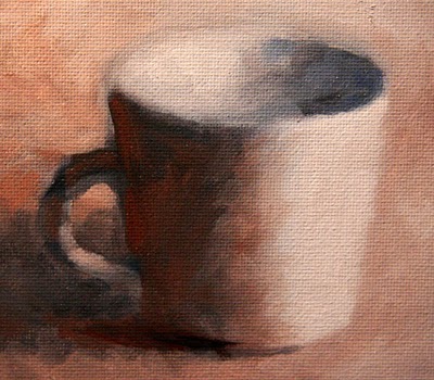 Warm/Cool study
This small study was done with only raw umber, ultramarine blue, and titanium white.
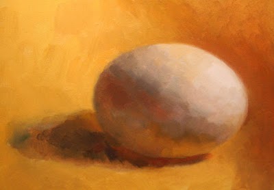 Egg Tiling, about 4 x 5 inches
 This was my first attempt at the technique Juliette calls "tiling". After doing a raw umber underpainting, the color phase of the painting is applied stroke by stroke, starting from the darkest dark and stacking "tiles" up to the lightest light. Each tile color is mixed on the palette and applied with a single, short brushstroke. From a distance it blends together, but up close each color note is distinct. You can see sharp edges around my tiles - bad! With practice the goal is to paint tiles that are close in value and color, with no sharp transitions. It's a veery slooow process. But actually very satisfying.
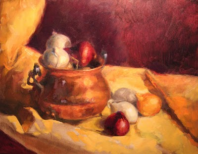 Copper Pot and Baby Onions
12 x 16, oil on panelI described how I started this painting in a
previous post. This is my first attempt applying all of the techniques in a single painting. But after a couple days I decided I had composed a painting with too many complicated elements and too-strong contrasting colors and values. I wanted to try something more subtle to practice the techniques, so I called this one "done" and moved on.
Trio: Two Pears and a Fig8 x 10 inches, oil on panel
I spent 2 and 1/2 days on this painting. The photograph does not show all the subtle "tiling" I sweated over, but you get the general idea. Juliette encouraged me to slow down (apparently my Daily Painting practice has made me a "speed painter") and look very carefully at the transitions. She had me pay close attention to midtones, the subtle gradations between the darkest darks and lightest lights across the surface of the pears. I feel like I learned so much within this one small painting, and I am so excited to get back to my studio and try more.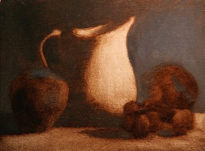 Pitcher and Fruit, 6 x 8 inchesUnfinished
I started this painting as a last quick project today, the last day, but did not have time to finish it. But I like the composition a lot, so maybe I'll set it up at home and finish it.These are the steps Juliette taught for creating a painting:
1. Draw the composition with pencil on paper
2. Transfer drawing to the canvas
3. Ink the major lines with an indelible fine point sharpie pen
4. Paint the whole canvas with raw umber, and "wipe out" to create a tonal underpainting
5. Let the underpainting dry
6. With full color, paint the background, ground plane, shadow side of objects, light side of objects, in that order
7. Apply color with small "tiles"
8. Paint the "least interesting" areas of the painting first - save the best for last
More various notes and tips from Juliette:
- Practice mixing a color wheel with lots of beautiful, clean neutrals
- Lay a note down for a color and leave it - don't over-mix.
- Your palette tends to reflect the painting - mix the colors you will need
- To "pump up" the light in a painting, focus on super-extending the halftones - don't focus on the darkest darks and lightest lights.
- Look at Chardin
- Look at Fantin Latour
- A strong image will read well from a distance
- Economy - solve problems using less (ie, solve an edge using a shift in color, instead of a shift in value)
- Become rock-solid in a few simple things
- Lump shadow shapes and light shapes, not individual objects
- Try one bright color note in a mainly monochromatic painting
- Copy master works, analyze for lines, arcs, value, color distribution
A few links:
Fletcher Palette
Picture Perfect Viewfinder
 Sketch after Michaelangelo
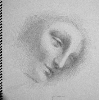 Sketch after Leonardo