Search this Blog
Sadie's Blogs and Website

For posts 2006-2010
please visit
sadievaleri.blogspot.com

Sadie’s current site is at
SadieValeriAtelier.com

UPDATE February 1, 2021

I have recently discovered that unfortunately this Squarespace blog has failed to maintain most the images for older posts on this blog. Luckily, the original Blogger version is still live at sadievaleri.blogspot.com and all the posts and images from 2006-2010 are still visible there.

For my current artwork, teaching, and blog please visit Sadie Valeri Atelier.


Entries in musings on art (21)

Friday
Dec102010

Motivation and Discipline Don't Help


My art studio, 2004

This was one half of my small kitchen in the 1-bedroom apartment I lived in. I did not have stable north light, so I hung a sheer white curtain to filter the direct sunlight.


In 2004 I took a class that taught me the basic historic technique for creating a layered oil painting. To practice I set up this little studio in my kitchen and a did a painting using the method I was learning in the class. 


Study for Vase and Creamer

9 x 9 inches, pencil on paper
2004


The still life was the first drawing and the first oil painting I had done on my own in about 10 years. I was exhilarated and thrilled, and mostly just so relieved when I made this little painting.

Vase and Creamer

9 x 9 inches, oil on panel
2004


It had taken me years of "thawing out" a severe, crippling artists' block to get to the point where I could even attempt to make a painting.

...

For many years after I graduated from art school at RISD I was very discouraged as an artist. I did not ever make any art on my own, outside the occasional life-drawing class. I felt like I was an artist. But a real artist paints, and I was not painting. I felt like I "should" be painting. 

I think I was stymied by my idea of what art and painting should be, by my idea of what was "Important Art."

Important Art was what was showing in the New York gallery scene of the 1990's, or in the New York MOMA. Important Art was what my art school friends who went on to do Masters of Fine Arts degrees were doing: very large, abstract or semi-abstract paintings.

I had never had an inclination to paint abstractly, and the semi-abstract figure-ish work I was introduced to in art school looked to me like what an insane person might paint.

All that was interesting to me intellectually, and I liked to look at it and talk about it with my friends, and I admired many of them for their skill with painting abstractly, but I never felt a shred of desire to paint that way.

But the only other option for a painter, other than Abstract or Figurative (semi-abstract figure-ish), was to be a Bad Artist. A bad artist was a "sellout" who sold pictures of flowers or children or seascapes at tourist galleries. I was very afraid that if I made that kind of art I would be a Bad Artist.

I left art school believing that Important Art came entirely or mostly from your head, and that art done while looking at something in real life was just a "study". Landscape, Figure, Portrait, and Still Life were all ok to do as studies, but if you were to do that for your real Work, you would fall into the category of Bad Artist.

I had been accepted into the most prestigious art school in the country based on my high school portfolio of highly realistic drawings and paintings done from life. And then I was taught that that was not art.

So, feeling like I was never going to be a Real Artist much less an Important Artist, I just stopped making art. I described myself to acquaintances as a designer, never as an artist.

For years I let people people assume I'd majored in design at the Rhode Island School of Design, and did not reveal that I'd spent all of my 4 years there doing figure drawing and oil painting.

But over the years after art school I got very depressed. I put in hours at my graphic design job, and mostly just killed time between my working and sleeping hours.

But I always knew what my problem was, I always knew that I would feel better if I could start painting. So I tried very hard for a lot of years to start painting. In fact, in my head, I was trying very hard to get back to painting pretty much all of the time.These were the things I tried:

  • Trying to be "disciplined"
  • Trying to be "motivated"
  • Making plans to do x just 10 minutes a day
  • Being angry and disappointed at myself
  • Putting enormous pressure on myself
I did a LOT of that, all the time, for many years, and none of it was successful for helping me get back to making art. It just made me feel worse.

I began to realize that my idea that I might be a Bad Artist was stopping me from doing ANYTHING creative. So I decided to do the smallest, tiniest project that felt creative but that was NOT ART. As soon as I called it art, I could not make myself do it. 

So the smallest, easiest thing I could find to do, that was a tiny bit creative, was going to a fabric store and buying buttons. I spent a long time picking out the buttons. I did not make anything with them, I just bought them.

It sounds so silly, and it's completely embarrassing to me that that was my creative project. It was embarrassing to me even then, when I did it. But I had gotten to such a low point of despair, that doing something so small and insignificant as buying buttons felt better than the way I felt most the time.

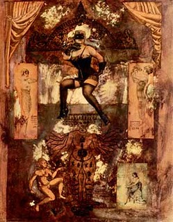
After I bought the buttons, and did some more equally small "creative projects", and after a while I felt inspired to play with collage. I had experimented with collage in art school, and so I started collecting materials again and making collages again. I did this on my living room floor, with the TV on. I made about 20 of these:

"The Stage", 2003
9 x 12, mixed media on paper


Then, in 2003 I saw the movie "The Girl with the Pearl Earring", which is about Vermeer. The movie imagines that the subject of his famous painting is his young maid, whom he trains to mix his paints. The movie is beautifully shot, with gorgeous sequences showing Scarlet Johansson sifting pigments and mixing oils by soft Dutch light filtered through small windowpanes. 

I started wondering if anyone taught how to do Old Masters' painting techniques any more, and if I could learn any of that. A few months later I found Kirstine Reiner's ad for art classes on Craigslist, offering lessons on mixing paint pigments and Old Master oil techniques. In early 2004 I signed up for 10 lessons.... and for the first time in many years, I picked up a paintbrush.

...

So many of my students struggle with how to set up a consistent practice outside of class hours. I can see the pressure they are putting on themselves, and their frustration. 

I tell them to remember learning to drive a car as a teenager: There is no way you could learn to drive if you only practiced an hour or two a week in Driver's Ed for a couple months. You had to put in dozens, maybe hundreds of hours behind the wheel for a few years before driving a car started to feel completely comfortable and natural. Learning to paint is exactly like that. As the instructor, I can give you some help and ideas and guidelines, but to get a feel for painting, you just have to do it on your own for a few hundred hours.

But I know it's hard to find a way to put in those hours. 

If you want to paint and you are not painting, then whatever you are currently doing to try to paint is not working, so try something completely different.

Instead, just do the smallest thing you can call "creative." Go for a walk and take some snapshots. But if you plan to do that and you find the weekend goes by and you didn't get around to it, do something smaller: just go browse in a flower shop or bicycle shop. And if that does not happen, just notice a crack in the pavement with some moss growing in it. Just stop and look at something that interests you for 5 seconds. 

That's it, you are being creative.

We are all creative all the time, we just don't realize it. If you want to paint, you probably already notice things around you all the time you wish you could paint or draw. Our ideas about what is Art, or what is Real Art, or what is Good Art versus Bad Art , don't help us to actually be artists. Don't focus on being a good artist. Don't try to be motivated or disciplined, don't even try to be an Artist. 

Just focus your attention on what interests you in your normal, day-to-day life, starting with just a few seconds or minutes at a time. The rest takes care of itself.

Monday
Nov302009

Sterling Boat: Session 10

Sterling Boat - DETAIL - work in progress
oil on panel

Sterling Boat - PREVIOUS DETAIL

The painting is coming down to the final stages, I'm hoping to be done in just a few more sessions. This is the stage of the painting when it gets hard to record the difference with a camera. I'm sorry to say the differences between the two above shots represents a solid 6 hours of work! The refinement is subtle but significant in real life, but almost impossible to see by the time the camera has degraded the images.

I was listening to one of my favorite podcasts today called "On the Media", and they were talking about the evolution of the book (OTM Episode: Book 2.0) now that we are crossing over into a digital era for reading. They interviewed writers and book publishers and future-thinkers who all had opinions, ranging from "it's not a book unless it has paper and glue and survives being dipped in the bathtub" to "the age of paper is dead and everyone will be reading in an entirely different way in 5 years."

One of the future-embracers was positing that the way writers WRITE will change in the new era, and floated his vision of a writer writing a novel live, online, with a real-time audience who will be intimately involved in the writing process, and that the whole process of creating a book with be collaborative and public. To which I though AAACK!!!

The interviewer suggested that many writers feel that solitude while working is integral to the process, and that some writers would not WANT to write if it had to be a public, collaborative process. The book-futurist (sorry I don't have his name, I don't take notes on my audio sources, unlike my husband who wisely documents everything he hears) said something to the point of "well, writers will just have to change they way they think about writing".

Writers will just have to change they way they think about writing. Wha????

As a an artist, I am probably on the leading edge of those who feel comfortable being public with my process - between my blog posts, my videos, and my teaching I try to make my process as transparent as possible, mostly for my own benefit of processing what I am learning, but also because some of you out there seem to enjoy seeing the thoughts behind the work. And yet, if I were forced to both share my process and allowed my visitors to comment on my decisions in real-time as I made them, and also modify my painting as the comments poured in, I would probably put down the brush and find something else to do!

I might be the extreme though, in that I shy away from collaboration, but some artists are more open to it. Personally, I need to be handled very carefully when I am in "work mode", as anyone who worked with me as a graphic designer can attest, I am not at all a "team player" when I am trying to be creative!

What do other artists think? Could you work with an audience? Even performing artists - could the musician practice with an interactive audience, could the actor rehearse with an interactive audience? Does it sound like a nightmare to you, or does it sound like a revolutionary frontier for artmaking?

------UPCOMING CLASSES AND WORKSHOPS-----------
I teach Classical Realism drawing and painting classes and workshops in my north light San Francisco studio. I also offer workshops at other locations in the US. Please visit my Teaching page for more information and to register!

Saturday
Nov282009

Sterling Boat: Session 8

Sterling Boat - DETAIL

Sterling Boat - DETAIL - previous stage
See previous post about this painting here

Today I worked on the wax paper - another 4-hour session. It shows how the wax paper slowly starts to look like transparent crumpled material, instead of only gradations of paint.

Painting is 99% drawing by the way. I never believed it more than I believe it now. If you want to be a better painter, study more drawing. I am amazed by how the same principles I teach the most beginning drawing student are the principles I must hold as my mantra all day every day: Look for the large shapes, bracket the values, work large to small and from shadow up to light...


It even applies to color, because you can't build a believable range of hue without understanding value bracketing.

Drawing is learning when it is appropriate to focus your decision-making on a particular scale: solve large problems first and smaller problems later. Use the problems that appear at a small scale to find solutions to the larger-scale problems.

Learning to draw is the discipline of ONLY tackling the problems you can solve at THIS stage of the artwork, without getting distracted or confused.

I've come to believe that drawing (and artmaking in general) is about organizing your thought process, and nothing else at all.

Sunday
Nov152009

How To Save a Drowning Drawing or Painting

Every artist knows the feeling: As we work on a piece we slowly become aware that our painting or drawing is not progressing, but instead it is moving further and further away from what we want it to look like. We work faster and faster, desperately fixing and adjusting, but the piece just gets worse and worse and we get more and more confused about what to do.


I call this "circling the drain" because we watch as our painting or drawing spirals right down into the sewer.

From observing my own process and also how my students sometimes get lost, I have found that this is the result of one single, simple problem, and there is one single, simple thing we can do to halt the downward spiral and salvage the work:

LOOK.

Easy enough, but it's amazing how often we all forget to look at our subject. Our tendency is to just stare at our own artwork and fiddle, which just makes the problem worse.

This is what I have posted in my studio to remind myself what to do when I get lost:

Look LARGE
Look OFTEN
Look LONG

This is what I mean by each of these:

Look LARGE
We naturally tend to zoom in our vision, narrow our focus, and look at tiny areas. Then we inch our way around the subject as if we are drawing by looking through a drinking straw. This makes mountains of molehills; literally, small variations on a contour are magnified when we zoom in. It also tends to make us exaggerate differences in value, so we make a dark patch too dark and a light patch too light.

The key is to back up and look at your artwork and your subject with large vision, comparing every part to every other part instead of focusing on small areas. Scan for the largest shapes, move your vision around often: if you are drawing a figure's head, move down and draw the feet for a while. Compare values deeps in the shadows to values far away in the light areas. Draw the whole, not the parts. Think big.

Look OFTEN
We all have a tendency to hunker behind our easels with our nose to our own artwork. After a while, we forget to ever peek around the easel at all and we end up drawing or painting essentially from our imagination. But if you discipline yourself to make a mark and LOOK before you make another mark you will suddenly find the painting or drawing flying along easily, growing magically from under your brush or pencil. Mark, look, mark, look, mark, look.....

Look LONG
When we are really, really lost, sheer panic sets in. That's when we have the urge to keep working faster and faster, and the artwork falls out of control at an alarming rate. When I get really, really lost I put down my brush and just stop and look at my subject. Then I bounce my vision between my subject and my artwork, back and forth, without ever making a mark. The longer I can discipline myself to look without making a mark at all, the clearer it becomes what needs to be adjusted. I tell my students to put down their charcoal and make a mental list of THREE things to change before they pick up their charcoal again.

A note on self deception:
Sometimes a piece of artwork is falling out of control but we can't admit it. We are too attached to the work we have already put in, and we want the artwork to be better than it is. This is where integrity comes in: the artist must hold themselves to the highest standard, otherwise no learning or exploration is happening. If we tell ourselves our art is "good enough" it isn't. That is self-deception.

To be art, it must be better than "good enough".

Do what it takes to learn and get better with every mark of every piece. Otherwise, we may as well go find a less demanding endeavor. Why be an artist, if not to get better?

--------TEACHING-----------
I am planning my teaching schedule for 2010 so take a look at my teaching page and sign up for my mailing list to be notified when I post new classes and workshops.

Friday
Aug142009

Blocking In (new wax paper series)

Wrapped Silver Goblet (in progress)
11 x 14 inches
graphite pencil on trace paper

I have a couple teaching opportunities coming up which I am very excited about: I'll be teaching drawing this fall semester to first-year MFA grad students at San Francisco's Academy of Art University, and there are plans in the works to possibly do a couple workshops next year (I'll keep you posted).

All of these opportunities are really exciting, and as I have been thinking about them I find I am "teaching" myself as I work all the time. Observing myself as I work helps me avoid problems deeper in the drawing. It's a sort of narration: At first it was non-verbal narration, simply paying attention to what I see and and comparing that to my drawing. But since I have begun teaching, that internal narration is becoming more and more verbal, as I imagine how I would teach as I draw.

I've been working the last couple days to begin a few new paintings of still life, and my first step is using straight-line block-in to establish the composition and forms.

Wrapped Bottle (in progress)
graphite pencil on trace paper
6 x 8 inches

Block-in for me is always the most stressful stage of a painting or drawing. Positioning the correct placement and shape on that blank space feels like plotting a course across the Atlantic.

I put the first few lines down and for a short while I feel like everything is going great, and then as I move into the next level of detail the errors begin to show up. And since the initial block-in is defining the whole shape with only a few lines, the errors are usually quite drastic and devastating to the design. Panic!

Beach Stone and Wax Paper (in progress)
graphite pencil on trace paper
5 x 5 inches

I tell my students that drawing well is essentially learning to control a sense of constant panic (I say that because I think a lot of us are quietly panicking in drawing class, and it helps the students know everyone else is feeling the same way, including me.)

But I try to use that panic to my advantage. The "Oh, no, it's all wrong!" feeling can plummet any draughtsman into despair and temptation to abandon the drawing (or crumple, scribble, or burn it).... But it's also a useful feeling. If we can react to the feeling with calm and acceptance, and simply take it as a reminder to stop and look, it becomes a useful tool.

My confidence in the block-in process has grown with my experience and now I know if something is wrong, if I keep my head calm and just look, I'll probably figure out the problem.

Not that I always do a perfect block-in by any means. And I certainly do not do my best block-ins when I am demonstrating in front of a group. But like any mental/emotional discipline, the more you practice, the easier it is to tap into problem-solving mode and focus, even in stressful situations.

Thursday
Jun042009

Web Design Tips for Artists

I look at a lot of artists web sites, and a lot of them are unnecessarily difficult to navigate. I thought I'd write up the common design problems I find, based on the opinions I developed as a web and interface designer for 11 years.

If you are an artist and you want your artwork to be seen, make sure your site follows these guidelines:

Navigation

  • Number One Rule: Keep it Simple
    Create one neat row of buttons down the side or across the top. Every page should show all the buttons to get to every other section of your site. The navigation buttons should never shuffle, move, or disappear.

  • If you are not sure how to solve a navigation problem, look at other websites. Chances are someone else has solved the problem already, and there is probably even a standard way users are expecting to navigate. Don't re-invent the wheel.

  • A button to get "Home", that says "Home" and nothing but "Home" should be on every page, in a logical place like the upper left or right corner.

  • Your name is your logo. If it clicks, it should go back to your home page. It should not open my email program and begin to compose an email to you.

Gallery
  • Make it as easy as possible for a visitor to see your artwork. The gallery should be no more than one click from the home page.

  • Gallery should be a page of small thumbnails of each image. Do not make the thumbnails tiny square crops of the larger painting. The thumbnail should be the whole painting.

  • If the user clicks a thumbnail, the painting should expand to a size big enough to comfortably see the painting. Between 500 and 1000 pixels on the long side.

  • When the image is big, the user should be able to click "Next/Previous" buttons to see the rest of your paintings. Don't make the user go back to the Thumbnail page to see the next image.

  • The "Next/Previous" buttons should be big enough to click easily, and should not move. Do not make your visitor reposition the mouse over and over to click the Next button.

  • You can separate your artwork into different galleries or categories, but let the visitor scroll though ALL your images with the Next button.

Flash
Why sites made completely in Flash are a bad idea
  • Search
    Search engines cannot read the text in an all-Flash website, so your site will not be catalogued and presented in search results as often and as well as it could be.

  • Bookmarks
    The user can't bookmark individual pages to save paintings they like. Allow users to find you again!

  • Back button
    Most users use the back button a lot while they navigate. Since an all-Flash site is embedded on one browser page, the back button takes the user not to the previous page within your site as they expect, but back to your entry page or completely out of your site to the previous site visited.

  • Images are too small
    I don't know if it is a template that Flash site builders are following, but you all make your images too small, and don't allow the user to make them bigger. The "zoom" feature is annoying because the visitor is forced to peer at the image through a keyhole.

  • Difficult to update
    Flash sites are the most stale sites out there. That's because they require a lot of work to update, a lot more work than a non-Flash site.

Miscellaneous Tips
  • Frames=BAD
    For about 10 minutes in 1994 a software engineer somewhere must have thought frames could be a useful navigation tool. They were wrong. Don't Use Frames Ever.

  • Web design is not print design
    Things that may look pretty in print, like tiny grey text and icons, simply do not work on a web page. Above all your site should be Clickable, Visable and Usable. Attractive is good, no one wants a goofy site, but you CAN make a clean and attractive site with buttons a user can easily click.

  • Branding
    Your name is your brand and it should be on every page and in the title bar of the browser of every page. Even better, type your name in text (not a graphic) at least someplace on the page (even the copyright), so a visitor can copy and paste your name. Make it easy for visitors to see, remember and record your name.

  • Location
    Say where you are! Don't share your address online of course, just include your city, state and country. Visitors to your website are coming from everywhere, orient them to your geographic location.

  • Email launching
    Don't make your "Contact" button launch my email program and compose an email to you. The Contact button should go to a Contact page.

  • Launching browsers
    Don't launch multiple browsers/tabs as the visitor clicks around your site, keep your site all within one window.
Final Word
Don't attempt to "be creative" with web site design. Your artwork should be what makes your site unique. Visitors who like your art will remember the art, not the decorations and cute buttons. Clean, professional, and organized are more important to communicate than "arty". Sometimes a few tasteful design elements work, but only if you are, or you hire, an experienced professional designer. Otherwise, just keep it simple.

Wednesday
Mar182009

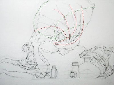
Bottle Collection: Preliminary Drawing

18 x 24, pencil on panel

I worked a lot more on the contour drawing, as you can see I'm having a lot of fun with all these waves and flourishes of wax paper.

I thought it might be interesting to show how I am cross-referencing movement curves, or pathways. The red lines are the obvious ones, the finger-like folds fanning out from the spiral-crushed center. What is exciting is to find the secondary lines of movement, the green lines. Together they make a meshed network, and you can find them running nearly any direction.

Wherever these curves intersect there is an "event", a significant landmark.

This approach really helps me plot and organize what at first seems like an overwhelming jumble. The network of pathways continues to subdivide in deeper and deeper complexity, so the deeper into the drawing, the easier everything starts to have a logical place. It always amazes me to see that even something "random" like crumpled paper has an internal logic.

One of the most important things I have learned about drawing is to not be afraid to change what I've put down before. I think it's common to draw a nice area and then realize it's in the wrong spot, and kind of "fudge" the drawing all around to keep the "good part".

What I have come to understand (and continue to try to understand) is that the overall logic is the most important thing, there is no "good part" of a drawing if the whole is not harmonious.

Thus I am ruthless with my eraser. Inevitably as I am drawing (and I think anyone who draws will relate!) I come to a point that doesn't "fit". I thought everything was right, but I get to a more detailed area and realize it's totally the wrong size and shape to fit all the detail that belongs there.

I've given up trying to preserve anything at all. If it's wrong, it's wrong, and I think in order to learn to be a truly accomplished draughtsperson we have to be willing to scrap all the previous work in order to improve the whole drawing. I did it many times for this drawing.

There must be a determination to really understand what is happening instead of preserving the pretty bits... anything less is merely the artist's ego dragging the drawing along to congratulate itself.

A drawing should only be a record of the artist's investigation of truth, and ego only obscures truth.

There you go, another life lesson from drawing.

Friday
Mar132009

Sotheby's "Women" Show

Apparently Sotheby's is putting together a show of art that depicts women as subjects. I thought I'd collect the highlighted images they've listed so far in the press release blurb:

Edvard Munch's Madonna (1895–97),
Picasso's Le Repos (1932),
Warhol's Turquoise Marilyn (1964),
Lucian Freud's Portrait of Rose (1978–79), (can't find this one, but here's Esther)
Richard Prince's Spiritual America (1983), featuring a rephotographed nude, prepubescent Brooke Shields.

Woman as virgin, muse, child. Seems like the theme here (so far) is the tension between available/unavailable -- desire and the inability to fulfill that desire. But could we say that applies to all depictions of women in art?

The show is called "Women". I'm curious to find out if there are any woman artists, or if women are only the subjects.

What do you think about a show that uses "women" as a subject? Is it a great way to collect some star artworks under a common theme, or is it celebration of the traditional objectification of women in art? If it is both, does the second detract form the first?

Tangentially, what about shows of women artists - which is what I thought the show would be before I read the press release. Should women be grouped together (and separated from men) as artists?

Wednesday
Mar112009

Book Report: "Guido Reni" by Pepper

Guido Reni
A Complete Catalogue of his Works
with an Introductory Text
by D Stephen Pepper

My husband found a mint copy of this out of print book and gave it to me for Christmas. I am so thrilled to own it! 228 reproductions including 16 color plates. The introductory essay, a biography of Reni's life and discussion of his intentions as a painter, illuminates the role of painting in the early 17th century.

I had always been taught to admire Caravaggio above all others of this era for his earthiness and "realism", and that it was due to the limitations of the times that his paintings were considered scandalous for his depictions of dirty feet, dead corpses and shadowed figures. But this essay by Pepper helped me understand the reaction to his paintings in the light of the times.

In the early 17th century there was an inherent tension between the concepts of heaven and earth, as neither was thought to be any less real than the other. The duty of painting was to be a visual philosophy, depicting ideas above all else. And so the way drapery and figures were treated in painting were at the time a visual discourse on ideas about the nature and order of the universe. Painting itself was seen as powerful enough to actually transform the soul of the person viewing it, so the job of the painter was nothing less than to elevate the souls of his viewers.

Caravaggio's work was scandalous not for the technique, but for the ideas. Instead of making paintings that elevate and educate, Caravaggio did not show the tension between planes of experience. To him a dead figure should be painted to appear truly dead in every way (appealing in our own era, but not the goal of the times). To do this was seen as denying the possibility of resurrection, denying redemption itself. So his paintings were not simply "too gritty" for the times, but were seen as lacking the ability to inspire.

As for Reni, seen in this light, I've developed an even greater appreciation for his paintings. His depiction of the human body is profoundly insightful, and his ability to show strength, vigor, weight and action while also showing effortless divinity gives his paintings a singing tension. He was described in his time as having a "mortal hand painting celestial vision".

For example, his treatment of drapery, structural but also flowing, was recognized and admired by his contemporaries, and apparently Bernini himself admired Reni's drapery before he sculpted probably the most striking garment in art history, the robes of St Theresa.

Reni studied in his youth with the Carraci, the artist brothers who founded a painting school in Bologna that emphasized studying from life and seeking beauty through naturalism. They rejected the non-naturalistic Mannerism and saw Raphael as their master, as he used knowledge of nature as a means for expressing ideas. Although Reni left the school, he was consistent with these ideas throughout his life.

After reading Pepper's introduction I am even more inspired by Reni's paintings. His deep and thorough knowledge of form allows him to elegantly describe complex tension and balance. He shows how earthly form can be an expression of the divine.

The act of observation can sometimes allow us to touch a plane of experience beyond what is perceivable by our five physical senses. In that sense, it is conceivable that a painting can "touch the soul". Certainly Reni's do.

Saturday
Feb212009

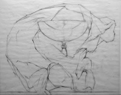
Master Copy: Guido Reni's Nessus & Deianeira

Sketch after Guido Reni's Nessus & Deianeira
9 x 12 inches, pencil on paper

block-in stage

This one I did primarily with block-in just to break it down and simplify it, and because it was hard to see the gesture of the kidnapped Deianerira as so much of her body is obscured by drapery. But I also cross-checked my block-in by visualizing the major curves and modifying the block-in where I had made errors that disrupted the overall lines of movement.

The centaur's extended leg in the lower left shows how using both approaches leads to greater accuracy. In the block-in stage the leg was elongated and stretched too far - easy to check by seeing where it falls directly under the tip of the extended elbow above. But when I corrected it I used curved method and found the correct shape according to the logic of the anatomy (which is just amazingly painted by Reni.)

I have been thinking a lot about figure drawing recently and all the approaches for teaching - not necessarily how the figure has been drawn, but how figure drawing has been taught.

The ateliers in the tradition of Gammell, Lack, and Angel all seem to use a sight-size approach and begin a student with cast drawing. I think most use the Bargue plates for beginning instruction as well. My understanding (without having studied this method) is that this trains the student to develop a highly sensitive ability to see angles, distances and values. It seems to me the goal here (again, without having direct experience) is to capture your subject exactly as it would appear if projected on the picture plane between you and the subject.

The tradition from the Golden Age of Illustration gave us constructive drawing in the vein of Bridgman and Vilppu and Reilly, (oh and Loomis), where the figure is conceived of as 3-dimensional wireframe construction of wedged rectangles and cylinders (if I may oversimplify and generalize these distinct methods). My understanding is that this is the approach used to teach animators and illustrators. The focus is on movement and the benefit is capturing gesture and pose quickly and efficiently, and teaching quickly and efficiently.
UPDATE 3/6: In the comments section of this post some excellent corrections and comments were made, be sure to read those.

Finally, as I would term it, "Expressive" figure drawing is from the tradition for teaching illustrators, but is highly influenced by expressionistic approach to fine art painting of the 20th century. The goal is to get a student to loosen up, use big arm movements, and to let go of inhibitions. I also believe this method is an ideological reaction to the art world's derision of figurative fine art in the last century, so the figure had to be approached with expressive marks to give it validity in an anti-figurative era (this is my own unsubstantiated theory). An example is here.

My teachers Ted Seth Jacobs and his students have modified their teaching from these traditions. Although Ted studied under Reilley and is connected to the 19th century academic lineage, he does not teach Bargue or sight-size. As I have documented in detail on my blog through my class notes (see "labels" in the right column), the focus is on developing an understanding of the 3 dimensional structure of organic form and the way light behaves on form. The student develops an understanding of life as organized and how each part is in harmony with the whole.

Each of these methods and their practitioners have critiques of the other methods: some lack form, some lack movement, some lack variety of markmaking, some lead to overmodeling.

I think each of these methods can benefit from the critique of the other traditions. Each approach has benefits and each has drawbacks, but ideally a student would spend at least some time studying each of the approaches.

That said... you can't go wrong by copying the Masters ;)

Friday
Jan162009

Book Report: Art and Fear


I read this book years ago, and I didn't realize how much it had influenced my thinking until I recently opened it to look up a quote to bolster my argument in a discussion, and found that I've lifted my own philosophy about talent and artistic training directly from the authors.

So, I re-read the book in full, and decided to write up a little book report and give them credit for their theory which I have been trumpeting as my own.

I don't agree with everything is the book, but it has some fabulous ideas that were very liberating to me at a time when I was terrified to make art.

"The prevailing view of artmaking today [is that] art rests fundamentally upon talent, and that talent is a gift randomly built into some people and not into others. In common parlance, either you have it, or you don't.... This view is fatalistic - and offers no useful encouragement to those who would make art.

"Artmaking involves skills that can be learned. The conventional wisdom here is that while "craft" can be taught, "art" remains a magical gift bestowed only by the gods. Not so. In large measure becoming an artist consists of learning to accept yourself, which makes your work personal, and in following your voice, which makes your work distinctive. Clearly these qualities can be nurtured by others. Even talent is rarely distinguishable over the long run, from perseverance and hard work."

"... our flaws and weaknesses, while often obstacles to our getting our work done, are a source of strength as well."

"Making art provides uncomfortably accurate feedback about the gap that inevitably exists between what you intended to do, and what you did."

"Your job is to learn to work on your work."

"Those who continue to make art are those who have learned how to continue -- or more precisely, have learned how not to quit."

I have learned the hard way (and I am sure the authors have learned this too) that this philosophy can raise ire. But I do think their words might resonate deeply with many people who want to make art but for one reason or another feel they are not "real artists".

All we can do is come up with a philosophy that helps us keep making art. So if this philosophy resonates with you, read this book, and then go forth and make art.

Also, I'll be teaching a drawing workshop for art-makers of all stripes soon, so if you think the philosophy would be helpful to you in the classroom, come to San Francisco in late April - details coming soon!

Thursday
Jan012009

Visualization

The model is posed or the still life is set up, your drawing paper or canvas is mounted on your easel, your brushes or pencils are prepared, and it’s time to start.

Stop.

Now, just look. Gaze at your subject, and look at how it really is, but in your mind’s eye begin to visualize. Visualize what your final drawing or painting will look like. See the light and feeling and gaze into it. Take time to record a very specific feeling and just look. You are looking at your subject but you are seeing your final artwork in your mind’s eye. You are visualizing the feeling of the final artwork.

Don’t make a mark until this vision of your artwork is detailed and specific. If you can observe yourself while you are visualizing, you will notice you are relaxing, losing your critical voice, detaching from your verbal brain, and your confidence and excitement for the work is building.

I first began to think about visualization some years ago when I heard an interview on the radio with a professor who experimented with teaching players to practice shooting basketball hoops through visualization. The group who practiced through visualization improved almost as much as players who practiced physically. The scientist described how he himself developed a visualization process, and realized if he visualized first he never missed a basket.

I realized that I already unconsciously do this when I draw or paint – I visualize the final outcome of my painting before I start. When I realized this, I started doing it consciously, slowing down and taking time to visualize. If while working I am feeling anxious and like the artwork is "getting away from me" I stop and visualize again. The image in my mind’s eye becomes more specific and detailed as I work, more specific and detailed than my painting will ever be; it’s a moving target on the horizon. But chasing an ever-refining intention pulls me further than I would ever get without a vision.

It actually works for just about everything. I recently sunk a pool ball with a perfect tap by practicing visualization (and I never play pool). It works for goals and dreams, too. So this year, instead of writing the detailed resolutions I usually write, I’ve just formulated a vision of what I want my life to look like, to feel like. It's still very specific, but not much about lists and plans. The more specific my vision, the closer I'll get to my goals.

Happy New Year!

Thursday
Dec112008

Waterhouse's Mermaid

JW Waterhouse's "Mermaid"
and my copy done at a
ge 12

I was reminded of my early love of this painting when I listened to a podcast lecture about Waterhouse from the Art Renewal Center website a few days ago.

The painting came to my house on the cover of Smithsonian Magazine in the early 80's and I fell in love with it. My drawing of it was taped to my bedroom wall for all of my early adolescence.

I had no idea how the painting fit into art history until a few years ago, as Waterhouse and the Pre-Raphaelites, if mentioned at all, were only a small footnote in my art history studies in art school. It was painted in 1905, when a few other things were going on in the art world around that time.

Despite the sentimental and politically loaded subject matter that squarely dates the image, I certainly could have learned a lot about figure drawing in my youth if I had known of and continued to copy the masters of the 19th century academic painters.

An interesting tidbit from the podcast: Waterhouse married a fellow painter, a woman named Esther Kenworthy. According to Peter Trippi, the expert on Waterhouse interviewed in the podcast, Esther "gave up painting" once she married Waterhouse.

Friday
Dec052008

Head or Heart?

Just read this quote in an SF Chron article about a contemporary operatic composer named Jake Heggie:

Heggie had been taught in school to "write from the head." Modern composers tend toward abstract, dissonant sounds, not melodies.

"I tried," Heggie says. "It's not me. It's when I took the good things from school - skills in counterpoint and harmony - and wrote from my heart that my work started to flourish."

This really resonated with me as I have been struggling recently with pinpointing the difference between so-called "abstract" and "realist" art.

I could venture into deep water really fast here, but I'm curious what other people think.

Is so-called "Expressionism", art after 1910-ish, for lack of a term, "art from the head"? (That would explain those long complicated artist statements).

Is so-called "Realism", both pre-1900 and current movements, "art from the heart"? (That would explain why contemporary realist art is derided as sentimental so often.)

Our difficulty with terminology for these movements is indication of our problems conceptualizing them. But most people know immediately if they are looking at "modern art", and think of it as sharply distinct from "old masters art".

Is Expressionism more emotional than representational work? It's supposed to be pure feeling, right, pure expression abstracted/taken out of the eye's understanding of the world? But isn't Realism more sentimental - therefore more "emotional"? Abstractionists would say realism is a false sentiment. And realists would say abstractionists are cynical. And round and round.

Is one the work of the mind, the other the work of the eye?

A class I took about the science of visual perception in college has stayed with me these 15 years, I think about it all the time. The class taught me that what we call "seeing" involves much more than simply the light that hits our retina. The light rays our eyes perceive are processed at many levels of the brain, from simply noticing movement or flashing lights, up through recognizing the illusion of space and form on a flat surface.

Is abstract art just another level of this, art that is produced in a different area of the brain than representational art? Maybe an "abstract" level of the brain it took Freud and the horrors of the World Wars to make us aware of? Maybe a more word-oriented, idea-oriented part of the brain? I find I discuss theory with my abstract artist friends and I discuss technique and history with my realist artist friends.

I am scouring my art books these days for explanations of the moment when interpreting what hit our retina switched to expressing what hit our mind's eye.

Interpretive versus Expressive? Is that an accurate delineation? Expressing what? Is our experience of witnessing an emotional scene understood by our brains in an abstract or literal way?

Can we trigger emotions like awe and distress with abstract art? Does representational art now fail to trigger these feelings in many people, ever since our former concepts of "self" and "humanity" were destroyed by industrialization and world war?

Is art about feeling? 20,000 years of humans representing the physical and visual world have been recorded. Is art control over our experience of an uncontrollable environment?

Surely 20th/21st century life is equally traumatic and fulfilling as it was when we huddled around fires 20,000 years ago? Our lives are no longer "ugly, brutish and short", but is our despair deeper?

I've also been thinking about that blog post I linked to last week, and what has stayed with me is the author's frustration at having to defend the validity of a now-100 year old art form over and over. And I realized feeling attacked and misunderstood is also part of the abstract artist's experience. We realists have to deal with being called sentimental which gets old - and we get tired of having to defend the validity of a 1500 year old art form over and over....

Anyway, more posts with pictures coming soon. I've finished the underpainting and am waiting for it to dry another couple days. In the meantime I'm sketching from Ye Olde Master paintings. (I'm more in love with Guido Reni every day.)

Will post the results of both soon.

Wednesday
Nov262008

Gender Observations

I was looking though the latest issue of American Art Collector Magazine recently (which is a monthly catalog of all the contemporary realist art gallery shows in the US) and I started to notice I could often tell if a painting was done by a man or a woman instinctively, without reading the name.

I decided to test myself, by looking at the painting and covering the name and then guessing the gender of the painter, and was shocked to find I was correct most the time.

I have no idea what makes a woman's painting look like a woman's painting, do you? It was based more on a feeling than anything else, certainly not ability or subject matter, but just an approach. Whether still life, figure, or landscape, I could tell. Figure I'd say is the easiest to identify, landscape the most subtle, but all are discernible.

I've looked at this magazine a LOT over the last year or two, I pore over every page every month and make notes of galleries and artists to watch, and I think it's been helpful to train my eye to recognize trends and styles in the realist movement. I noticed a couple months ago I could recognize different areas of the country sometimes (different "schools of training" etc). I can also tell who has studied with or been inspired by whom (David Leffel and Malcolm Liepke have apparently huge followings because it seems every issue has a splashy, red-nosed New York-style sprite drinking a martini, or a still life with a spray of "silver dollar" willow receding into black with some scattered grapes...). I also feel I can tell if someone has studied the Florence School/Bargue/Sight Size method.

But I didn't realize till just this month that gender is so obvious. Every painting is pretty clearly executed by a male or female hand. Of course this isn't a scientific study, just a feeling, but try it and maybe you can tell, too.

It also brings me to my other gender observation. Is it possible to paint a female nude without SOME aspect of sexism? It seems to me to be nearly impossible to paint a female that does not reference thousands of years of art history and have some element of a female stereotype implicit in the image.

How does a woman paint a woman without referencing how men have always painted women?

Tuesday
Jul012008

Sneak Preview: "Wax Paper I" and Thoughts on Realism

Wax Paper I (detail)
11 x 14 inches
oil on panel
(work in progress)

This is just a cropped detail of a larger painting I am working on right now - so far 26 hours and counting. My good camera is broken so I've had to photograph the stages with my inferior "point-n-shoot", but the good camera is being fixed soon so when the painting is done and the camera is fixed (whichever comes later) I'll post the final painting and all the stages.

I decided that posting frequently was making me feel like I had to complete something "postable" every few days. Sometimes a little pressure is good, but sometimes it makes me rush my process. So I'll be posting less frequently, but when I do I'll have something substantial to show, and I'll still publish all the process photos.

In the meantime, here are some thoughts I've had rattling around my head about realist art - or maybe it applies to non-representational/abstract art as well:

When we look at a painting we are confronting a situation of real/not real. Our minds flutter between these two paradoxical concepts embodied simultaneously. This flutter quickens to a thrum, and it is in this space, the simultaneous holding of the paradox, that our beingness is felt.

When we create, we are experiencing beingness – the loss of awareness of self, the loss of awareness of past and future. Nothing but the present moment exists, a true experience of reality. This state is difficult to enter, but in recording it an artist shares the experience. Looking at a painting we get a glimpse of this state of being.

The act of painting elevates the subject. Mundane objects are infused with an epic, monumental quality. Like a scent that fills us with longing for a certain afternoon years ago, a memory, the shadow of reality, can often strike us more deeply than the original. Paintings are the shadow of reality, the record of a memory. Through painting we reveal a depth of reality in the moment that can touch us more deeply than the subject itself.

Sunday
Feb242008

What I Wish I Learned in Art School

I went to art school because I loved to paint and draw as a kid, and I wanted to be an artist. I didn’t really know what an artist did. Four years and 80 thousand dollars later, I graduated from art school with only a vague idea of what an artist did, and a very fractured portfolio made up of a hodge-podge of homework assignments and figure drawings.

After art school I spent years floundering and did not make enough money to support myself even marginally until several years after college. I felt blindsided - I’d been very successful and my teachers told me I was talented, so I though an "art career" would magically unfold before me.

Only now, 15 years after graduation, do I have an idea of what I should have been taught about how to "be an artist". Lucky you, I am going to share for free what an 80K education should have taught me.

If I were advising an art student now, this is what I would tell them:

Decide what you want to do
For someone who likes to draw and paint in high school and wants to draw and paint for a living, there are essentially two routes: Illustration, where other people pay you to create what they want, and Fine Art Painting, where you create what you want and hope other people buy it.

(There are a lot of other art careers, but I'm just focusing on what I wish I'd been told, as someone who just wanted to paint and draw with traditional materials.)

Illustration
Illustrations are the drawings and paintings you see in magazines, newspapers, on book covers, and in advertising. Publishers and ad agencies hire freelance illustrators to make those drawings and paintings. A successful illustrator has a consistent flow of freelance illustration jobs, and hopefully earns a living at it.

Fine art
Fine art paintings are sold in galleries to people who want to have original art in their homes and offices. A successful fine artist develops relationships with galleries, consistently shows and sells their artwork, and hopefully earns a living at it.

Research art schools
Not all art schools are the same. Some art schools are better for fine art, some are better for commercial art/illustration. Some are more expensive than others – a lot more expensive. Pick an art school that will help you achieve your goals. Visit schools and ask lots of questions about what their graduates do, and what the school does for career counseling. Be specific about what you want.

What to do while you are in art school
By the end of senior year you need to have a portfolio of 10-20 works of art that hold together as a group and look like one person made them all. If you want to be an illustrator, develop a portfolio of illustrations all in one distinct and cohesive style.

If you want to go the fine art gallery route, pick a theme and do a series of paintings on that theme. Show that you can work hard and consistently to make a cohesive body of work.

Portfolio development takes forethought and planning. You won’t have a cohesive portfolio if you just gather up all your art school homework assignments and call it a portfolio. Art school should teach you this. It doesn't.

What to do after graduation
The minute you leave art school, if not before, professionally photograph your portfolio, and start to submit your artwork. Submit your illustration portfolio to small local magazines and print publications. Submit your fine art portfolio to local galleries and art fairs. Submit to contests and juried shows and apply for grants. Submit over and over and over. Assume you will get lots of rejections, even if you were successful and "talented" in art school.

For Illustration
Do illustration jobs for free or very cheap at first so you have professional pieces in your portfolio, not just school assignments. Over time you will replace the college projects with professional work. Publications who hire you to do illustrations need to have an idea of what the finished illustration will look like based on your previous work, and they need to know you are reliable and will finish the project, so present your work accordingly.

For Fine Art
If you want to go the gallery route, this is the most important thing you need to know about being a gallery artist: Galleries need to see that you can produce a consistent output of paintings at a consistent level of quality. Galleries are a business and they need to know you are reliable. Some galleries won’t even consider painters who don’t have a master’s degree so you might need more school. Grad school will teach you how to produce consistently, and they will teach you talk and write about your work.

No one ever told me these things at art school. As an artist you have to think of your artwork as a product and you have to learn to market and sell your product. Most artists don’t like to do this. But most artists also don’t like to operate cash registers or serve food either.

LINK:
This blog post Is Going to Art School Worth It? is a great article about deciding whether to go art school.

Wednesday
Jan022008

Few Strokes. Light touch. Focus on the subject.

Few strokes.
Light touch.
Focus on the subject, not the painting.

These are the words I taped to my easel today. I have not touched a brush in 4 months - four months - so I needed to bring some guidance into the studio with me.

Those three points were things I have thought a lot about. The break from painting and the focus on drawing this past fall gave me time to get some distance and think about what I need to work on in the paintings.

Light touch
I have had an over-heavy hand. Especially when I start to get anxious about how the painting is going, I start to apply more and more pressure on the brush. Sargent told a student that the bristles of the brush should never touch the canvas, that there should always be a layer of paint between them.

Few strokes
Another thing I do is labor a painting. I put down paint in haste and spend stroke after stroke "correcting". I was so struck when I saw paintings by Seaton at Arcadia gallery in New York last summer. The reproductions don't show it well, but every mark is distinct. Nothing is blended, each stroke is left to be what it is. Too many brushstrokes in a painting ruin the painterly quality.

Focus on the subject
When a painting is going badly, I find myself looking at the painting a lot more than my subject. Juliette's painting workshop this summer taught me to spend a LOT of time looking at the subject. Slowing down and looking is a natural state for an artist - it's only when I get anxious and "in my head" that I only pay attention to the painting. Attention on the end result is disaster for a painting. A painting is only the evidence left behind after careful looking. I need to focus on the process, not the result.

Even with all this, I needed one more thing to take into the studio with me, one of my favorite quotes:

It is a tremendous act of violence to begin anything. I am not able to begin. I simply skip what should be the beginning.

-- Rainer Maria Rilke

When I found this quote a few years ago I felt such relief to hear the poet capture how I feel about beginnings. It's not enough to say I am often afraid to begin... it actually does feel violent.

So I promised myself all I had to do was get into the studio and make a few monochromatic marks. I wouldn't even attempt color. Just get some paint on the canvas!

Armed with all this I stepped into my chilly little studio, turned on the space heater, and started prying the lids off jars and paint tubes stuck shut for months. I poked around for a while, tidying up, tuning my radio to the classical station, straightening all the still life objects on my shelves, tracking down the good roll of extra-sticky masking tape I keep losing. I found a million things to do but finally my gessoed panel was mounted, my still life set up, blobs of raw umber, ultramarine blue, and white were on my palette, and my favorite set of brushes laid out.

And really, I had a great time. I love to paint! The results aren't really worth posting, just a tiny brown painting of a pitcher, but I just loved feeling the paint again. And I think I made some of my best marks yet - a light touch is the way to go.

More soon!

Saturday
Dec082007

Abstractionism, Realism, and Honesty

A very good friend of mine is an abstract painter. We’ve been friends for 12 years now, and I’ve had the privilege of visiting her studio many times.

I know very little about abstract painting, but my friend seems to value my opinion, so she tells me a lot about her thought process, her technique, what she is attempting, whether she feels she fails or succeeds. I am always impressed by both the work itself, and what she puts herself through to make it.

She is as rigorous and self-disciplined as any traditional atelier-trained painter. She continually challenges herself, continuously refines her technique, and never allows herself to rely on cheap flourishes. Nothing is accidental, everything is deeply intentional, and not a mark is made without questioning her own intentions, conscious and unconscious. She has the deepest integrity an artist can have – she is brutally honest with herself. Her paintings are gorgeous and moving on every level.

However, as we talk about art, we sometimes come up against a wall, the divide between realists and abstractionists. Our visual goals as artists are quite different.

There is a huge division between the world of abstract painters, who are concerned with surface, and the world of realist painters, who are concerned with illusion. Interestingly, both sides would probably use the word “decorative”, with a sneer, to describe the other.

When I hear realist artists deride abstract artists, or vice versa, I wonder why each threatens the other so much. Both sides tend to cite the worst or most extreme examples of the other to characterize these two large and varied movements.

Many artists on both sides are doing the hard work of excavating truth. On the other hand, in both realist and abstract art, there are dishonest artists. Dishonest artists make paintings with the main goal of shoring up their ego, instead of the goal of revealing truth, connecting with the universal.

When evaluating art, whether realist or abstract, I ask myself "is the artist being honest with herself?" Everything comes into focus when this question is asked.

Derision tells us nothing about the art and everything about the critic.

Whether abstract or realist, only honesty counts.

Thursday
Nov292007

Perception and Distortion

What we think we see is very different from the raw data that hits our retina. Our brains warp and remodel everything we see to fit into what we think we know about the world.

By the time an image has been projected onto our retina, has stimulated the appropriate light-receiving cells, has transferred visual data to our brain, has been interpreted at base-level cortex and higher-thinking cognitive levels of our minds, has been categorized, compared to what we already know, and emotionally processed, by the time all this has happened, what we think we “see” has been interpreted and distorted and edited so to have nothing to do with the original beams of light that entered our corneas. The original data has been distorted; not distorted “beyond recognition” but distorted TO recognition.

The artist must learn to recognize these distortions and exorcise them, or use them. When we look at our own work and are not happy with what we see, we are becoming aware of our unconscious distortions. It’s an uncomfortable feeling, but it helps us learn. We must learn to recognize and edit out unconscious distortions, and learn how to present truly “raw” data to the viewer, just as real life presents raw data.

This is not to promote what is commonly called “slavish copying.” Artists can and should choose to distort the image, choose what to emphasize, choose what to leave out, choose to guide the viewer. But any distortion has to be intentional, deliberate.

Even abstract artists I know talk of trying to become aware of the unconscious associations, influences, references and baggage visible in their art. They attempt to only present visual information with intention.

Lack of intention, or ignorance on the part of the artist is always painfully obvious to the viewer, consciously or subconsciously, and detracts from their experience of a work of art.

The pursuit of art is learning to throw away unconscious distortions and replace them with conscious choices.

Kind of like life.