This week I've begun Ted Seth Jacobs' 6-week figure drawing workshop, offered through the Bay Area Classical Artist Atelier.
So far I have come up with this summary of my impression of Ted's method for figure drawing. (Note: This is my impression, and not a direct quote, he may describe it differently):
The human body is an organized, "designed" system of interlocking structures.
This interlocking system as a whole is affected by the downward pull of gravity, and also by the upward pressures of supports.
The whole or the parts can be seen as being pulled and pushed, resulting in draping (like a suspension bridge) and bulging.
Pressure from supports (like a chair, etc) makes the masses of the body take on the characteristics of the underlying support.
Ted draws figures with all curved lines. He feels that sharp corners are antithetical to life, and would result in "starvation, disease, and death!" (he says with a deep ominous tone, and then a chuckle).
As you can imagine, I am having a hard time reconciling this, considering I have spent most of 2007 studying a more formal, straight-edged block-in method.
But I believe there is a correlation between the two approaches - both are investigations into the underlying system. One uses perfect arcs and straight lines, the other uses undulating curves. But both are looking for the structure, the system, the truth, the architecture, the energy of the human form.
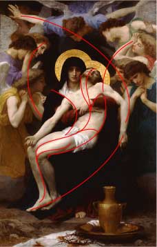
Ted looks for lines of action, grouped in "families" of similar directions. He teaches us that every contour (visible line) is in direct relationship to these invisible lines of movement.
Today he drew a demo for us of Bouguereau's Pieta at the Legion of Honor museum here in San Francisco. This is my approximation of some of the relationships he diagrammed for us:

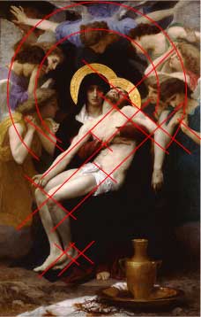
Below, the more formal/rigid analysis I've been practicing these last few months. I try to find main angles that repeat in parallel all over the form. The angel of the jaw as it correlates to the angle of the ankle, and everything between.

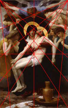
And this last one is for fun - it's more about the composition and architecture of the entire painting, versus the structure of a single figure. It's fascinating to find these diagrams in a painting, so clear and yet hidden at first glance. We feel it before we see it:

As a final note: My favorite concept so far from Ted:
"The simplest definition of a 'gesture' is an action showing intention, or desire."