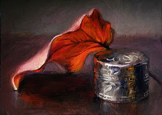
It's done! I only needed two more hours on it, I could have finished it the day I started it if the sun didn't set so early. (See below for the process shots done a few days ago).
I decided some of the background brushstrokes were too busy & distracting so I smoothed it out a bit, and made the background cooler to contrast with the warm leaf. I also increased the value contrast by making darks darker and lights lighter, and I refined the top side of the leaf.
Click this picture to see an animation of the process:

I bought some new paint colors today from the recommended palette on handprint.com. I could immediately tell a satisfying difference in the reds: quinacridone rose (PV19) and cad. red medium (pr108) instead of my old alizarin and cad red deep seemed like more intense color out of the tube and remained saturated when mixed with other colors. There was a real "wow" feeling when I started playing with them.
The yellow (P154, called perm. yellow light in the Rembrandt line of paints) I didn't like so much- felt really "weak", like I had to use a LOT to make an effect and it seemed chalky when mixed with other colors - "reduced chroma" the handprint site would say. But I'll keep playing with it, and maybe try some other yellows he recommends. I also bought a new green (PG7) but I am scared of green... after having a primary palette theory drilled into my head in art school, I feel like I should mix my own green, but I'll try it. I need a whole lesson on using greens I think.
I also bought a full-spectrum light that clamps to the easel and shines on the canvas, if it works (although I'm doubtful) maybe I can continue painting after the sun goes down. And I bought several new round brushes - Kolinski brushes are my favorites. Looking forward to experimenting with my new toys this week.
